
Plotting a histogram in Python is easier than you’d think! And in this article, I’ll show you how.
I have a strong opinion about visualization in Python, which is: it should be useful and not pretty.
Why? Because the fancy data visualization for high-stakes presentations should happen in tools that are the best for it: Tableau, Google Data Studio, PowerBI, etc… Creating charts and graphs natively in Python should serve only one purpose: to make your data science tasks (e.g. prototyping machine learning models) easier and more intuitive.
So in this tutorial, I’ll focus on how to plot a histogram in Python that’s:
- fast
- easy
- useful
- and yeah… probably not the most beautiful (but not ugly, either).
The tool we will use for that is a function in our favorite Python data analytics library — pandas — and it’s called .hist()… But more about that in the article!
Download the code base!
Find the whole code base for this article (in Jupyter Notebook format) here:
Plot histograms in Python (GitHub link)
Download it from: here.
Before we get started…
In this article, I assume that you have some basic Python and pandas knowledge.
If you don’t, I recommend starting with these articles:
- Python libraries and packages for Data Scientists
- Learn Python from Scratch
- Pandas Tutorial 1 (Basics)
- Pandas Tutorial 2 (Aggregation and grouping)
- Pandas Tutorial 3 (Data Formatting)
Also, this is a hands-on tutorial, so it’s the best if you do the coding part with me!
What is a histogram?
Start with the basics!
What is a histogram and how is it useful?
A histogram shows the number of occurrences of different values in a dataset. At first glance, it is very similar to a bar chart.
It looks like this:
But a histogram is more than a simple bar chart.
Let me give you an example and you’ll see immediately why.
Let’s say that you run a gym and you have 250 clients. For some reason, you want to analyze their heights. Good!
You have the individual data points – the height of each and every client in one big Python list:
height = [185, 172, 172, 169, 181, 162, 186, 171, 177, 174, 184, 163, 174, 173, 182, 169, 174, 170, 176, 179, 169, 182, 181, 179, 181, 171, 175, 170, 174, 179, 171, 173, 171, 170, 171, 175, 169, 177, 185, 180, 174, 170, 171, 186, 176, 172, 177, 188, 176, 179, 177, 173, 169, 173, 174, 179, 181, 181, 177, 181, 171, 183, 179, 174, 178, 175, 182, 185, 189, 167, 167, 172, 176, 181, 177, 163, 174, 180, 177, 180, 174, 174, 177, 178, 177, 176, 171, 178, 176, 182, 183, 177, 173, 172, 178, 176, 173, 176, 172, 180, 173, 183, 178, 179, 169, 177, 180, 170, 174, 176, 167, 177, 181, 170, 178, 168, 175, 166, 182, 178, 175, 171, 183, 187, 164, 183, 185, 178, 168, 181, 174, 172, 168, 179, 180, 172, 179, 169, 180, 176, 174, 175, 181, 180, 179, 176, 176, 179, 177, 180, 174, 161, 182, 189, 178, 175, 175, 175, 176, 169, 172, 170, 177, 174, 178, 174, 181, 177, 189, 164, 172, 181, 191, 174, 176, 174, 183, 174, 180, 174, 168, 177, 179, 183, 175, 172, 179, 177, 177, 175, 182, 178, 187, 182, 179, 166, 179, 178, 180, 182, 173, 180, 172, 187, 168, 165, 166, 170, 169, 187, 174, 167, 182, 172, 168, 181, 179, 173, 184, 176, 185, 179, 185, 176, 168, 190, 172, 174, 171, 174, 177, 177, 179, 186, 175, 168, 168, 172, 165, 180, 173, 174, 175, 167, 170, 180, 179, 173, 186, 168]
Note: it’s in centimeters, folks!
Looking at 250 data points is not very intuitive, is it?
As we’ve discussed in the statistical averages and statistical variability articles, you have to “compress” these numbers into a few values that are easier to understand yet describe your dataset well enough. These could be:
- mean:
175.952 - median:
176 - mode:
174 - standard deviation:
5.65 - 10% percentile:
168 - 90% percentile:
183
Based on these values, you can get a pretty good sense of your data…
But if you plot a histogram, too, you can also visualize the distribution of your data points.
For this dataset above, a histogram would look like this:
It’s very visual, very intuitive and tells you even more than the averages and variability measures above. I love it!
Bins and ranges. A histogram is not the same as a bar chart!
You most probably realized that in the height dataset we have ~25-30 unique values. If you simply counted the unique values in the dataset and put that on a bar chart, you would have gotten this:

But when you plot a histogram, there’s one more initial step: these unique values will be grouped into ranges. These ranges are called bins or buckets — and in Python, the default number of bins is 10. So after the grouping, your histogram looks like this:
As I said: pretty similar to a bar chart — but not the same!
When is this grouping-into-ranges concept useful?
For instance when you have way too many unique values in your dataset. (In big data projects, it won’t be ~25-30 as it was in our example… more like 25-30 *million* unique values.)
For instance, let’s imagine that you measure the heights of your clients with a laser meter and you store first decimal values, too. Like this:
height = [185.7, 172.3, 172.8, 169.6, 181.2, 162.2, 186.5, 171.4, 177.9, 174.5, 184.8, 163.6, 174.1, 173.7, 182.8, 169.4, 175.0, 170.7, 176.3, 179.5, 169.4, 182.9, 181.4, 179.0, 181.4, 171.9, 175.3, 170.4, 174.4, 179.2, 171.9, 173.6, 171.9, 170.9, 172.0, 175.9, 169.3, 177.4, 186.0, 180.5, 174.8, 170.7, 171.5, 186.2, 176.3, 172.2, 177.1, 188.6, 176.7, 179.7, 177.8, 173.9, 169.1, 173.9, 174.7, 179.5, 181.0, 181.6, 177.7, 181.3, 171.5, 183.5, 179.1, 174.2, 178.9, 175.5, 182.8, 185.1, 189.1, 167.6, 167.3, 173.0, 177.0, 181.3, 177.9, 163.9, 174.2, 181.0, 177.4, 180.6, 174.7, 174.8, 177.1, 178.5, 177.2, 176.7, 172.0, 178.3, 176.7, 182.8, 183.2, 177.1, 173.7, 172.2, 178.5, 176.5, 173.9, 176.3, 172.3, 180.2, 173.3, 183.3, 178.4, 179.6, 169.4, 177.0, 180.4, 170.3, 174.4, 176.2, 167.8, 177.9, 181.1, 170.8, 178.1, 168.1, 175.8, 166.3, 182.7, 178.5, 175.9, 171.3, 183.6, 187.8, 164.9, 183.4, 185.8, 178.0, 168.8, 181.2, 174.9, 172.4, 168.6, 179.3, 180.8, 172.3, 179.1, 169.1, 180.8, 176.3, 174.9, 175.4, 181.2, 180.5, 179.2, 176.8, 176.5, 179.7, 177.4, 180.1, 174.1, 161.4, 182.2, 189.1, 178.6, 175.4, 175.2, 175.3, 176.1, 169.3, 172.9, 170.0, 177.5, 174.2, 179.0, 175.0, 181.9, 177.3, 189.1, 164.6, 172.1, 181.4, 191.2, 174.5, 176.3, 174.6, 184.0, 174.3, 180.1, 174.1, 168.4, 177.9, 179.0, 183.8, 175.3, 172.3, 179.4, 177.4, 177.7, 175.6, 183.0, 178.2, 187.4, 182.7, 180.0, 166.2, 179.6, 178.5, 180.9, 182.3, 173.6, 180.9, 172.6, 187.7, 168.0, 165.4, 166.1, 170.7, 169.3, 187.7, 174.0, 167.9, 182.7, 172.5, 168.6, 181.3, 179.7, 173.4, 184.4, 176.8, 185.7, 179.0, 185.4, 176.7, 168.7, 190.7, 172.7, 174.8, 171.8, 174.8, 177.5, 177.2, 180.0, 186.8, 175.3, 168.6, 168.9, 172.0, 166.0, 181.0, 173.0, 174.1, 176.0, 167.6, 170.8, 180.0, 179.7, 173.3, 186.9, 168.2]
This is the very same dataset as it was before… only one decimal more accurate.
But because of that tiny difference, now you have not ~25 but ~150 unique values. So if you count the occurrences of each value and put it on a bar chart now, you would get this:
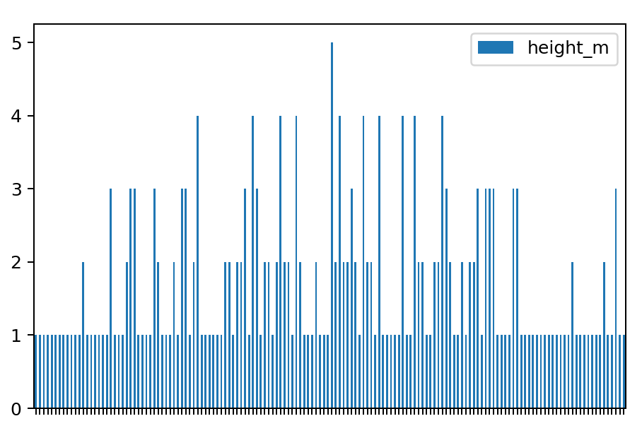
Ouch…
A histogram, though, even in this case, conveniently does the grouping for you. You get values that are close to each other counted and plotted as values of given ranges/bins:
Beautiful… but more importantly: useful!
How to plot a histogram in Python (step by step)
Now that you know the theory, what a histogram is and why it is useful, it’s time to learn how to plot one using Python. There are many Python libraries that can do so:
pandasmatplotlibseaborn- …
But I’ll go with the simplest solution: I’ll use the .hist() function that’s built into pandas. As I said in the introduction: you don’t have to do anything fancy here… You rather need a histogram that’s useful and informative for you — and for your data science tasks.
Anyway, the .hist() pandas function is built on top of the original matplotlib solution. (See more info in the documentation.) So the result and the visual you’ll get is more or less the same that you’d get by using matplotlib… The syntax will be also similar but a little bit closer to the logic that you got used to in pandas. So in my opinion, it’s better for your learning curve to get familiar with this solution.
Either way, let’s see how this works!
Note: if you are looking for something eye-catching, check out the seaborn Python dataviz library.
Step #1: Import pandas and numpy, and set matplotlib
One of the advantages of using the built-in pandas histogram function is that you don’t have to import any other libraries than the usual: numpy and pandas.
At the very beginning of your project (and of your Jupyter Notebook), run these two lines:
import numpy as np
import pandas as pd
Great! numpy and pandas are imported and ready to use.
And don’t forget to add the:
%matplotlib inline
line, either — so you can plot your charts into your Jupyter Notebook.
Step #2: Get the data!
As I said, in this tutorial, I assume that you have some basic Python and pandas knowledge. So I also assume that you know how to access your data using Python. (If you don’t, go back to the top of this article and check out the tutorials I linked there.)
For this tutorial, you don’t have to open any files — I’ve used a random generator to generate the data points of the height data set.
If you want to work with the exact same dataset as I do (and I recommend doing so), copy-paste these lines into a cell of your Jupyter Notebook:
mu = 168 #mean
sigma = 5 #stddev
sample = 250
np.random.seed(0)
height_f = np.random.normal(mu, sigma, sample).astype(int)
mu = 176 #mean
sigma = 6 #stddev
sample = 250
np.random.seed(1)
height_m = np.random.normal(mu, sigma, sample).astype(int)
Run them!
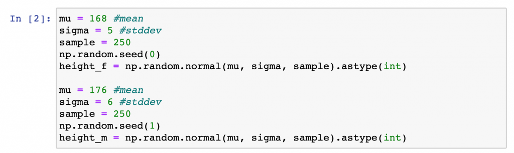
For now, you don’t have to know what exactly happened above. (I’ll write a separate article about the np.random function.) Just know that this generated two datasets, with 250 data points in each. And because I fixed the parameter of the random generator (with the np.random.seed() line), you’ll get the very same numpy arrays with the very same data points that I have.
In the height_f dataset you’ll get 250 height values of female clients of our hypothetical gym.
In the height_m dataset there are 250 height values of male clients.
Step #3: Prepare the data!
The more complex your data science project is, the more things you should do before you can actually plot a histogram in Python.
Preparing your data is usually more than 80% of the job…
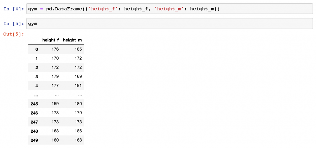
But in this simpler case, you don’t have to worry about data cleaning (removing duplicates, filling empty values, etc.). You just need to turn your height_m and height_f data into a pandas DataFrame.
Run this line:
gym = pd.DataFrame({'height_f': height_f, 'height_m': height_m})
Great:
We have the heights of female and male gym members in one big 250-row dataframe.
gym
[OPTIONAL] Basics: Plotting line charts and bar charts in Python using pandas
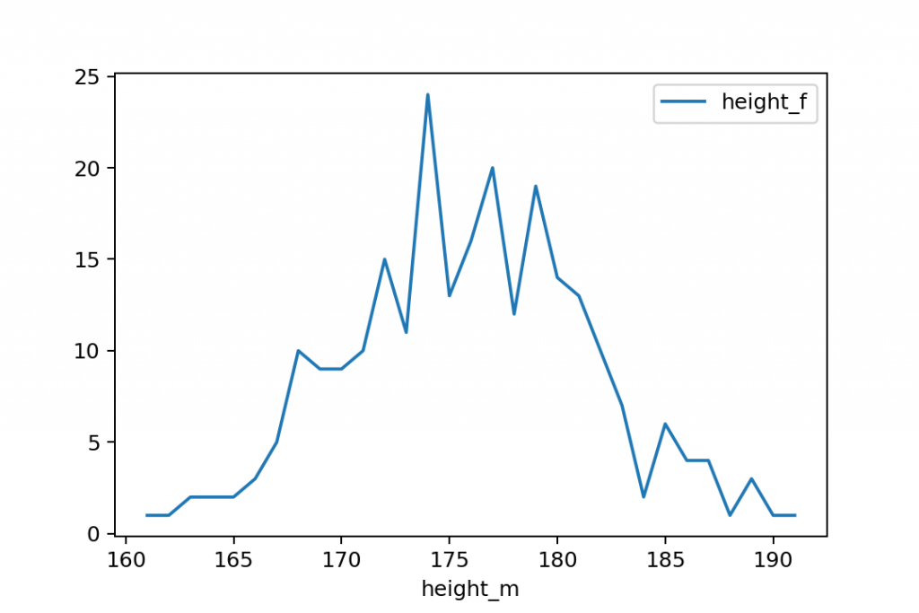
Before we plot the histogram itself, I wanted to show you how you would plot a line chart and a bar chart that shows the frequency of the different values in the data set… so you’ll be able to compare the different approaches.
And of course, if you have never plotted anything in pandas before, creating a simpler line chart first can be handy.
To put your data on a chart, just type the .plot() function right after the pandas dataframe you want to visualize. By default, .plot() returns a line chart.
If you plot() the gym dataframe as it is:
gym.plot()
you’ll get this:

Uhh. Messy.
On the y-axis, you can see the different values of the height_m and height_f datasets. And the x-axis shows the indexes of the dataframe — which is not very useful in this case.
So let’s tweak this further!
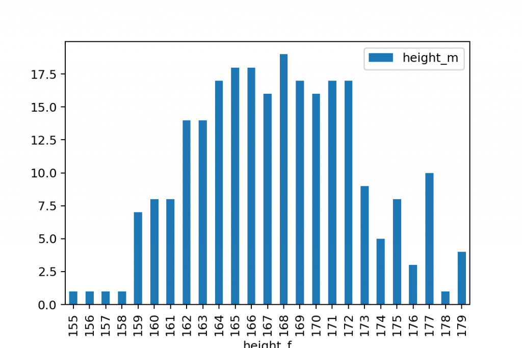
To get what we wanted to get (plot the occurrence of each unique value in the dataset), we have to work a bit more with the original dataset. Let’s add a .groupby() with a .count() aggregate function. (I wrote more about these in this pandas tutorial.)
gym.groupby('height_m').count()
If you plot the output of this, you’ll get a much nicer line chart:
gym.groupby('height_m').count().plot()
This is closer to what we wanted… except that line charts are to show trends. If you want to compare different values, you should use bar charts instead.
To turn your line chart into a bar chart, just add the bar keyword:
gym.groupby('height_m').count().plot.bar()
or:
gym.groupby('height_m').count().plot(kind='bar')
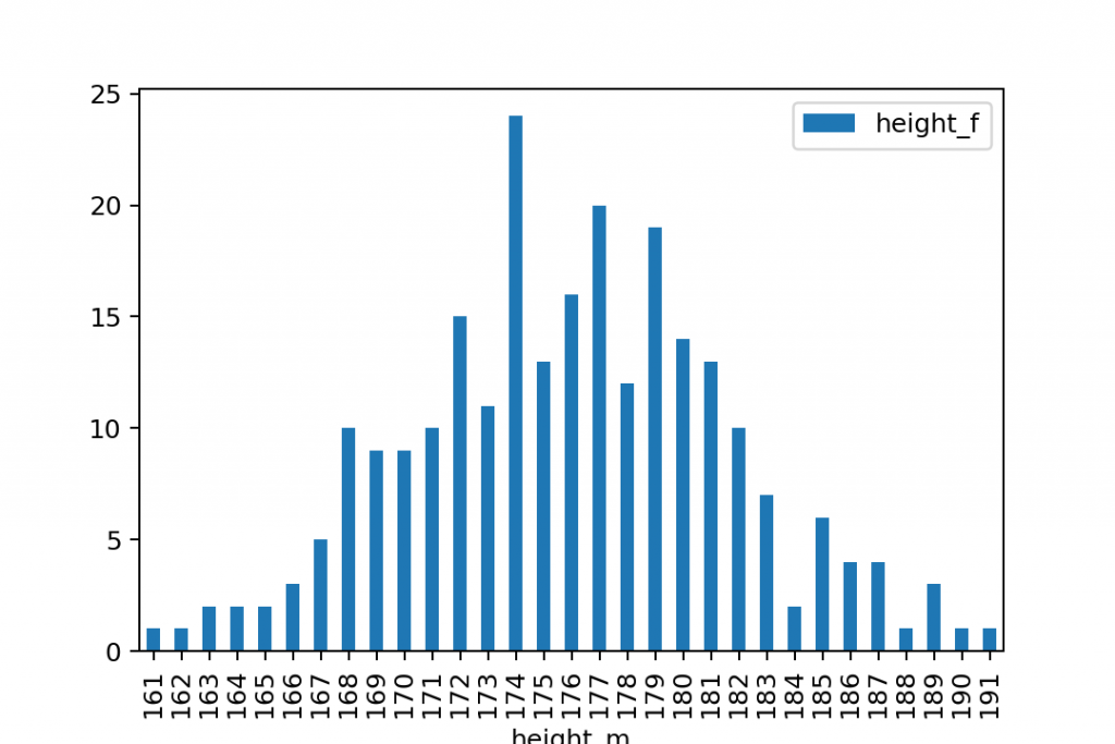
And of course, you should run this for the height_f dataset, separately:
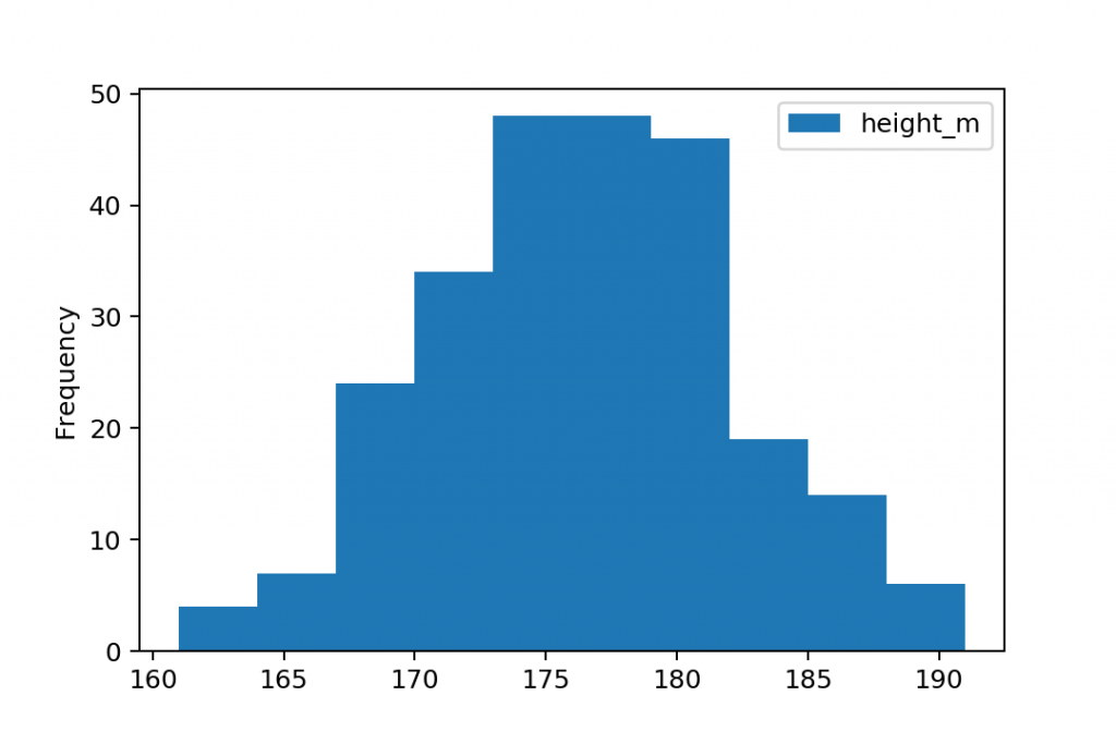
gym.groupby('height_f').count().plot.bar()
This is how you visualize the occurrence of each unique value on a bar chart in Python…
But this is still not a histogram, right!?
So…
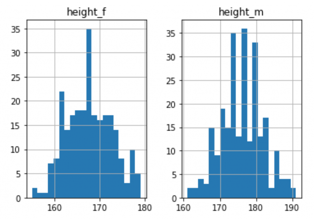
Step #4: Plot a histogram in Python!
Once you have your pandas dataframe with the values in it, it’s extremely easy to put that on a histogram.
Type this:
gym.hist()

Yepp, compared to the bar chart solution above, the .hist() function does a ton of cool things for you, automatically:
- It does the grouping.
When using.hist()there is no need for the initial.groupby()function!.hist()automatically groups your data into bins. (By default, into 10 bins.)
Note: again, “grouping into bins” is not the same as “grouping by unique values” — as a bin usually contains a range of values. - It does the counting. (No need for
.count()function either.) - It plots a histogram for each column in your dataframe that has numerical values in it.
So plotting a histogram (in Python, at least) is definitely a very convenient way to visualize the distribution of your data.
If you want a different amount of bins/buckets than the default 10, you can set that as a parameter. E.g:
gym.hist(bins=20)
Bonus: Plot your histograms on the same chart!
Sometimes, you want to plot histograms in Python to compare two different columns of your dataframe.
In that case, it’s handy if you don’t put these histograms next to each other — but on the very same chart.
It can be done with a small modification of the code that we have used in the previous section.
gym.plot.hist(bins=20)

Note: in this version, you called the .hist() function from .plot.
Anyway, since these histograms are overlapping each other, I recommend setting their transparency to 70% by using the alpha parameter:
gym.plot.hist(bins=20, alpha=0.7)
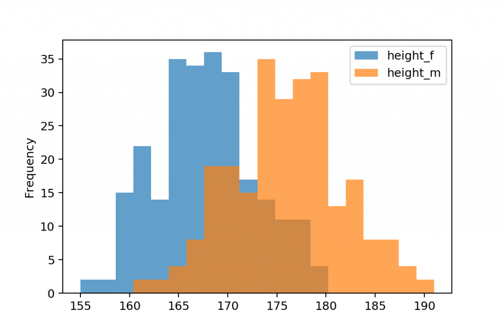
So you can see both charts.
Conclusion
This is it!
Just as I promised: plotting a histogram in Python is easy… as long as you want to keep it simple. You can make this complicated by adding more parameters to display everything more nicely.
But you don’t have to…
Anyway, these were the basics. Just use the .hist() or the .plot.hist() functions on the dataframe that contains your data points and you’ll get beautiful histograms that will show you the distribution of your data.
And don’t stop here, continue with the pandas tutorial episode #5 where I’ll show you how to plot a scatter plot in pandas.
- If you want to learn more about how to become a data scientist, take my 50-minute video course: How to Become a Data Scientist. (It’s free!)
- Also check out my 6-week online course: The Junior Data Scientist’s First Month video course.
Cheers,
Tomi Mester
Cheers,
Tomi Mester