
The usefulness of visualisations in data analysis is often questioned. At the end of the day, the outcome of the analysis should be quantifiable, right? Well, maybe. But even if we stick to that assumption, visual representations of our data can be immensely helpful in making our analysis more efficiently and Tableau is an excellent tool for that. This post offers you a step-by-step hands-on tutorial on how to get started using it.
If you decide to tag along for this ride, I seriously recommend actually downloading Tableau and doing the exercises, because it’s both fun and possibly immensely useful in your projects.
Today’s guest blogger is István Korompai. He is a member of the data visualisation team at Starschema Ltd and co-author of the company’s dataviz.love blog. Starschema is a first-class player on the Business Intelligence scene, having a long-standing history of excellence in the areas of big data, dataviz, data science and architecture.
If not the first, maybe the most famous example of the significance of display is Frank Anscombe’s quartet. This dataset consists of 4 series, whose descriptive statistics (mean, variance, regression line) are virtually identical, so one would naturally assume that the sets would look roughly the same when shown visually. However, once plotted on a scatter graph, we realise this is far from the truth.
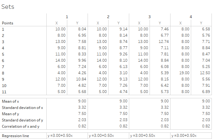
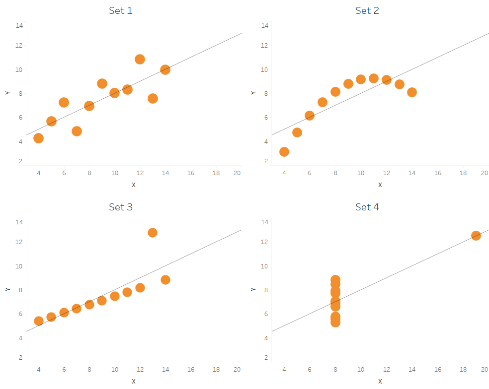
Isn’t this an exceptional case though, do visual representations offer any value to an analyst or data scientist? While visualisation on its own will probably not give you definitive answers, it is incredibly useful in augmenting other capabilities. I, for one, cannot imagine doing data cleansing or deciding how to handle outliers without using some visual abstraction. I think I speak for all of us when I say that we are all much happier to scan through a histogram, boxplot or scatter plot than to scroll for eternity through a table of values trying to find some pattern in the numbers.
Tableau
Another piece of evidence for the importance of visualisations is the sheer number and variety of tools available. In the Business Intelligence sector, the market leaders are Qlik, Microsoft’s Power BI and Tableau but there are also plenty of free-to-use kits available. These alternatives were developed with often a much narrower use case in mind. Plus, even Google is getting involved in the market now, and we all know that means that the industry is promising.
Since we wanted to show you something in this post and give you some useful hands-on experience, we had to pick one, and that is going to be Tableau. We have four reasons for this:
- It’s easy to set up and use (gimme those scatterplots in three clicks, no more)
- You can use it to create beautiful visualisations (yes, that is important)
- It has a constructive and pleasant user community all around the world
- AND it’s an all-rounder so you can build an entire analytics solution around it if you happen to love it and invest a lot of energy into it
The aim in the rest of this post is to show you a few features, so you hopefully see the potential and get hooked. Because of this, the writing below is going to become a bit more tutorial-like, so when you are using Tableau later, you can check back and quickly find what you’re looking for. Also, Tableau has a lot of features, and this post is in no way exhaustive in covering them.
Setup
Confession: I personally hate installing and setting up software but Tableau got us covered, it’s easy. They’ll ask for your details, but after that, it’s as easy as downloading an installer and running it.
Go to the download site of the trial. Click on ‘Start your free trial’, fill in your details and click ‘Download now’. Once downloaded, run your installer and Tableau will install.
Setup: done.
Connecting to data
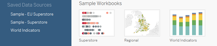
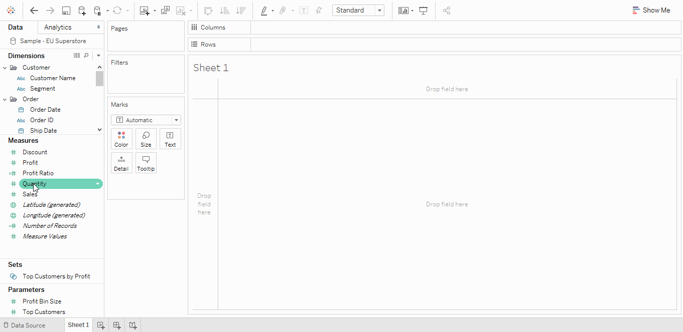
Once launched, the landing screen of Tableau gives you the opportunity to connect to data of your own, open sample workbooks or connect to sample data sources. We are going to do the latter.
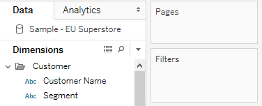
Click on ‘Sample – EU Superstore’ under ‘Connect’ / ‘Saved data sources’. Tableau will then connect and navigate to the viz creation UI. The dataset describes the orders of a fictional retailer and is often used in tutorials and guides as it’s got everything to showcase most of Tableau’s functionalities.
In an everyday scenario, you would connect to one of the many other available sources, e.g. a .csv extract or your favourite SQL server. If you have another data set on which you normally do tutorials, I invite you to use that one, as that will give you even better feel for the tool’s benefits.
Terminology
Like any software, Tableau has its own terminology, and it’s useful to quickly go through the items more specific to this software before we jump in, so, later on, you’ll understand why we’re putting “pills on shelves”. If you’re a more hands-on person just skip to the next section, but be warned, I’ll be using these terms.
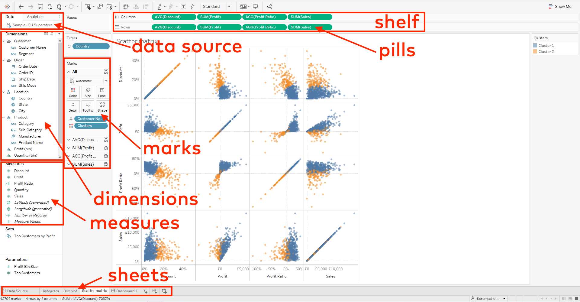
Workbook
The name of a Tableau file that holds visualisations. It usually takes the format of .twb or .twbx.

Data source
A single data table compiled in Tableau. It is the source of the data that individual visualisations will use as their basis. It can be created from a single source connection or multiple of them, through joining or unioning.
Connection
Within a data source, you can have multiple external sources of data, and you’ll have a connection to each of them. These are established making use of Tableau’s wide range of data connectors (Excel files, SQL servers, Amazon, Google Analytics, etc.)
Sheet
A single tab within a workbook that holds a single, coherent visualisation.
Dimension
A data field type. In a sheet, you’ll see them being under the dimensions category on the left. They are fields, that you would usually categorise or order numeric data by (e.g. time or product category).
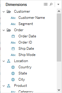
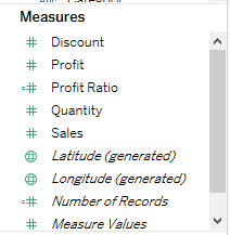
Measure
The second data field type. These are numerical data, such as sales amounts, quantities, profit, etc.
Calculated field
Tableau offers the opportunity for the user to calculate new fields based on the data already in the data source. One example would be calculating profit based on available revenue and cost data.
The coding language used for these is Tableau-specific. However, it is somewhat similar to SQL.
Shelf
The name of few designated areas on the User Interface of Tableau. These are the areas onto which you can drag data fields to create your visualisations. Few of them are the ‘Filter’ shelf, the ‘Rows’ shelf and the ‘Columns’ shelf.
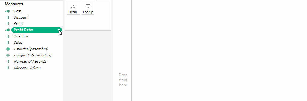
Pill
When you start dragging a data field from your dimensions or measures, it becomes a pill, essentially the drag-and-droppable object on the UI. It also has a “carrot”, a small downward-pointing arrow, that opens up and options menu when clicked.
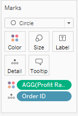
Marks
When you drag a pill onto any of the shelves, data will be displayed using Marks. Each measure will be visualised in each intersection of dimensions you put on your visualisation. You can also change the mark type using the ‘Marks’ card.
Discrete or continuous
These are another classification of data fields. Discrete means that there is a finite set of values the variable can take, while continuous means that there is no limit, the variable can be any numerical value within its range. Dimensions are usually discrete, while measures are usually continuous.
Aggregation
Okay, not limited to Tableau as a concept but it’s important because Tableau aggregates measures. Always. Keep that in mind, and you’ll have much more ease understanding what the heck is happening on your screen. Tableau uses five primary aggregation types: Sum, Average, Median, Count and Count (Distinct). The first three are only available for numerical data (measures) while the two different types of Count are available for all.
Let’s get exploring
Enough of just reading, let’s get clickin’.
We are going to create the following visualisations, a histogram, a box plot and a scatter plot matrix. These are relatively rudimentary on their own, yet they are still incredibly useful in data discovery.
The first two is useful for understanding distributions of data and thus deciding how to deal with outliers. The third is a versatile tool allowing you to understand correlations in n-dimensional spaces (n-dimensional space is just a fancy way of saying that your data has a lot of different attributes), thus getting an initial feel on how to proceed with building your models.
Alright so we have our Tableau open, our data loaded, let’s create our first “viz”.
Histogram
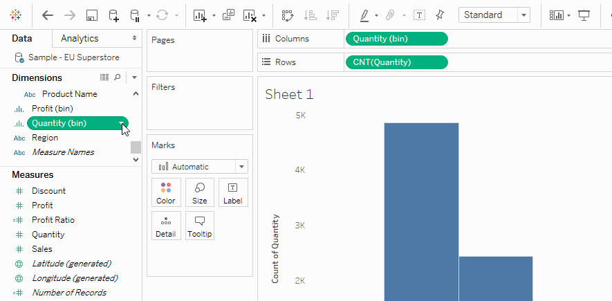
A histogram is a special bar chart that shows so-called bins of numerical data or dates on the horizontal axis and counts on the vertical axis. Let’s use our Superstore dataset to see the distribution of our data regarding Sales amounts.
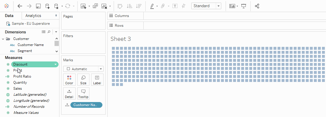
Let’s drag the Quantity field to the ‘Columns’ shelf. Now click on ‘Show me’ in the upper-right hand corner and click histogram.
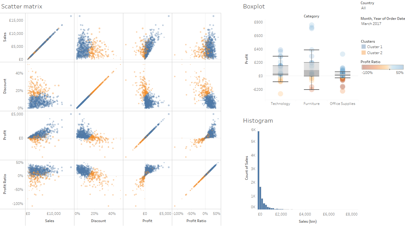
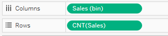
Boom! You just created your very first Tableau viz. Looking through it, it seems we have a more-or-less exponential data distribution over Sales. Knowing this distribution is going to come in handy because many pre built prediction models assume a normal distribution of the variable so this could be a source of inaccuracy later on.
Let’s look at what the use of the magic menu ‘Show me’ has done. We see that the content of our ‘Columns’ and ‘Rows’ shelf has changed. We now have a ‘Sales (bin)’ pill on the ‘Columns’ shelf, that we didn’t have at all before. Tableau created this for us and had specified a bucket size that seems to work well with our ‘Sales’ measure. The ‘Rows’ shelf has ‘Sales’ as well, but it’s been aggregated using ‘Count’ because that’s what we want in a histogram.
What if I wanted to change the bin size of the histogram? The Sales (bin) dimension has been added to our dimensions pane. We can right-click it, go to ‘Edit…’ and change the bin size there to see our histogram become finer or coarser.
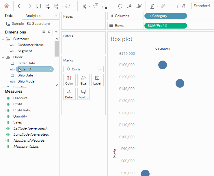
Box plot
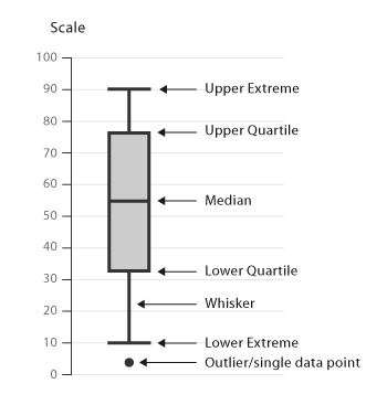
Let’s say we want to see how orders are distributed within product categories based on their Sales value. A box plot would be an excellent tool to see this because it packs a lot of punch. It shows you the following things: the range of the data, the bottom and top quartiles (in other words the Inter-Quartile Range, IQR) and the median. The reason it’s so useful is that it shows the central tendency, the skew and the range of our data very efficiently, using very little space.
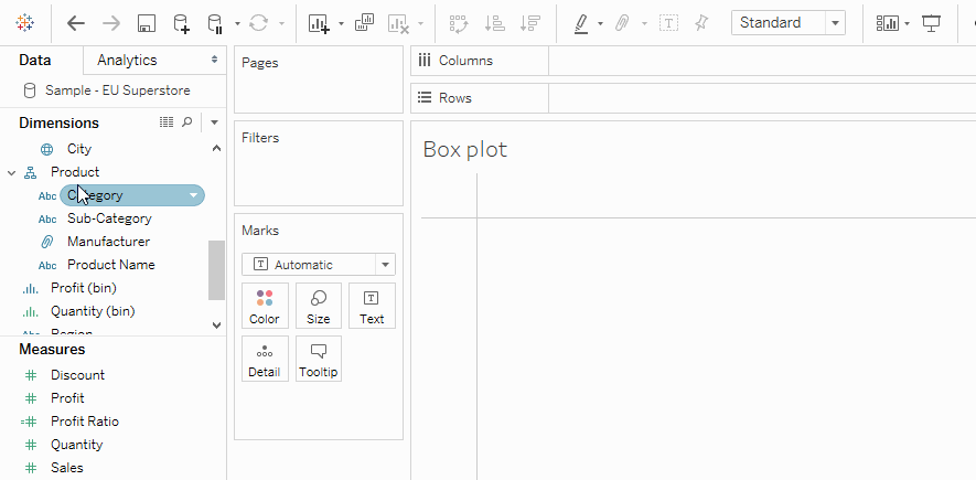
Let’s say we wanted to understand how our product categories compare based on these characteristics. Let’s create a new sheet and bring ‘Category’ into the ‘Columns’ shelf, and ‘Profit’ onto ‘Rows’. By default, we get a bar chart, but we would like to see individual marks for the different orders, so let’s change the Mark type to ‘Circle’.
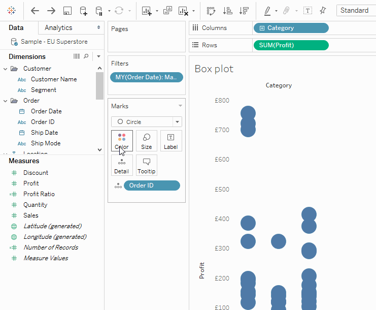
Level of detail and filters
Hm, we still only have one mark per category. Remember, I said in the terminology section that Tableau always aggregates. Well, we can specify the level of aggregation in our viz. Let’s bring ‘Order ID’ onto the detail shelf. What this will do, is that it’s going to “explode” this single mark per category into individual marks for all orders in our data set resulting in several thousand marks. If we wanted to look at only a subset of these, we could bring in filters. I am only interested in a single month’s sales, so I’m going to bring ‘Order Date’ onto the filter shelf, select ‘Month / Year’ in the popup and filter for ‘March 2017’.
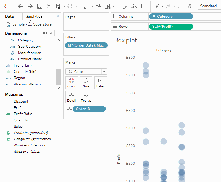
Okay, so it’s kinda hard to understand how many circles are there in the middle, so let’s bring down ‘Opacity’ a bit by clicking the ‘Color’ shelf and adjusting the slider. I’ll also bring down ‘Size’ in a similar way.
Now, it’s easier to understand but we would still benefit from the box plots so how can we bring them on? Let’s switch to the ‘Analytics’ pane and drag a ‘Box Plot’ pill onto our viz. Pow!… box plots.
If you’re really feeling fancy, drop ‘Profit ratio’ onto ‘Colour’, and you’ve got yourself a nice visualisation.
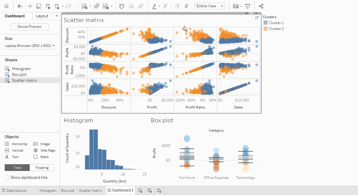
Scatter matrix
A scatter graph is a plot that can encode two variables by default, but this can be extended by the addition of multiple graphs into a matrix. This can be useful when trying to understand data that has more than three variables.
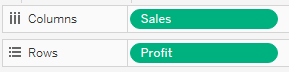
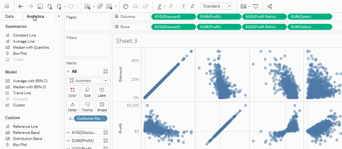
Let’s first build a single scatter plot, and we’ll move from there. Say, we want to see our customers in the two-dimensional space of ‘Sales’ and ‘Profit’. Create a new sheet and bring ‘Sales’ onto ‘Columns’, ‘Profit’ onto ‘Rows’ and ‘Customer Name’ onto ‘Detail’. Let’s also bring the opacity down and change our shape to a filled one so we can see the difference in density better. Easy, right?
So how do we move from a single graph to a matrix? Easier than it seems, let’s just pile our measures onto the ‘Row’ and ‘Column’ shelves. I’m going to move ‘Sales’, ‘Discount’, ‘Profit’ and ‘Profit ratio’ onto both. (Keep ‘Customer Name’ on the ‘Detail’ shelf). We’ve got ourselves the matrix showing the two-dimensional “views” of our four-dimensional data space.
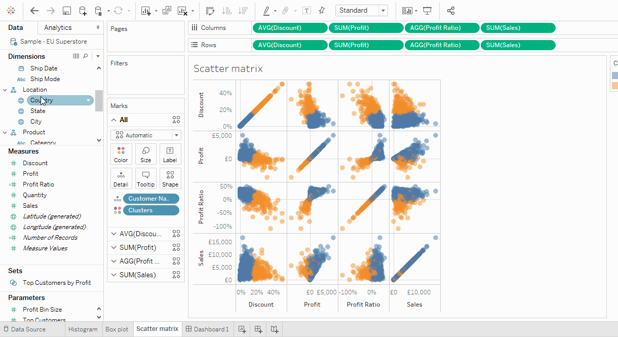
We can encode additional variables by using the colour, size and shape of our marks. Try out the latter, but I would advise it only in the case that you have a handful of marks on your viz, as it can be hard to distinguish between shapes if they are overlapping. For the ‘Colour’ shelf, I’m going to show you a trick. Let’s suppose I’m planning a marketing campaign and I want to segment my customers based on these four variables that I have in the view. I can make use of Tableau’s clustering capabilities, by going to the ‘Analytics’ tab and dragging ‘Cluster’ onto the view. Tableau will divide the marks into groups based on the variables selected and colour them accordingly.
Dashboards
Once we’ve created our visualisations, we might want to see them all in one place, next to each other, instead of switching between tabs. To do this, we can make use of dashboards. Let’s create a new dashboard and add our three brand new vizes.

We can make adjustments to the layout by moving sheets around or by dragging the edges of layout containers.
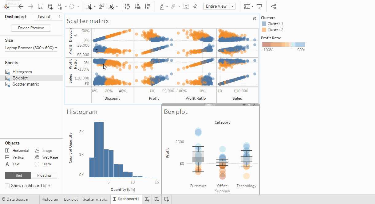
Another great feature is the possibility to use filters whose effects span multiple sheets. Let’s go the scatter plot matrix sheet and add country as a filter, Select all and click ok. Now right click the freshly added filter, and under Apply to Worksheets select All using this data source.
Now when we modify this newly created filter, it’s going to filter all our visualisations in the workbook, which were made from the Superstore data source. Let’s go to the dashboard again and add this filter by right-clicking any sheets “carrot” and from under filters adding country. This will bring the newly created Country filter on. Select any country from the list, and the visualisations will refresh to represent the data for only that country.
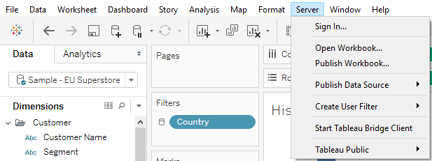
You can export dashboards as images or publish them to the web, either to Tableau’s Public repository or if you have access to a Tableau server than to that.
Closing remarks
As I mentioned in the beginning, this is in no way exhaustive of Tableau’s features. In fact, every step of the way of this short tutorial I could have made several remarks on how you can tweak and customise your work, starting from editing colours to imposing multiple types of vizes on top of each other, etc. For this reason, I encourage you to check out Tableau’s online learning materials (hey, that’s where most of us started).
If you happened to like Tableau and would like to purchase a license or would like help in deploying it for your business, please contact Starschema on hello@tableausoftware.hu!
Cheers,
Istvan Korompai