
In my previous article about statistical averages, we discussed how you can describe your dataset with a few central values (mean, median and mode). That’s well and good… But there is a problem with statistical averages: they don’t tell you too much about the statistical variability (or in other words the spread or dispersion) of your data.
E.g. if you compare these two datasets:
[49, 49, 50, 50, 50, 51, 51]
and
[1, 1, 50, 50, 50, 99, 99]
In both, you’ll have these averages:
- mean:
50 - median:
50 - mode:
50
…by looking only at these values, you could say that the two datasets are very similar to each other. But that’s not true: the second one has much more spread, right? And in data science that is an important difference.
That’s where statistical variability comes into play.
In this article, I’ll show you my three favorite ways to discover the spread of your data. There are more — but I use these in real data science projects the most often.
These are:
- standard deviation
- percentiles
- histograms
Let’s dive in!
The role of statistics in data discovery
I use statistical measures quite often in the data discovery phase of my data projects.
Why?
Looking at your data for the first time, the catch is always the same. If you have millions (or even billions) of data points, you won’t have time to go through everything line by line. For a human, millions of data points are too many to interpret, understand or remember.
In real life, when you meet a new person and start getting to know her, you use a few common formulas (“how are you”, “nice to meet you”, “what’s your name”, “what do you do”).
Similarly, in statistics when you start to make friends with your data, you use some frequently used metrics to get to know it: mean, median, standard deviation, percentiles, etc.
These statistical measures won’t show you the full complexity of your data but you’ll get a good grasp and a basic understanding of what it looks like. Remember, statistics is about “compressing” a lot of information into a few numbers so our brain can process it more easily.
Now, of course, there are no golden rules about what exact metrics you should use… But there are some best practices. Let me show you mine!
Describing a data set with a few values
Let’s take this small, one-dimensional dataset:
[1, 1, 1, 5, 6, 23, 24, 50, 50, 50, 50, 50, 50, 76, 77, 94, 95, 99, 99, 99]
It has only 20 values.
Here’s the challenge:
Describe this dataset the best — using the fewest numbers!
If you could choose only one number (and if you think like most data scientists) this number will be the mean — which is 50 in this case.
If you could choose another number, that could be median which is also 50.
But as I said, you want to understand the spread of your dataset, too.
So the third number to take a look at will be standard deviation.
The standard deviation for this dataset is 35.45.
What does it mean? Simply put: we can expect most data points to be around a ~35.45 distance from the mean (which was 50). Okay, this is not yet a definition – we will get there soon – but you get the point: if standard deviation is low (compared to your mean value) then the statistical variability of your data set is low — if it’s high then you can expect a higher spread and a wider range.
Another great measure to describe variability is using percentile values — more specifically the 10th and 90th percentiles… What are these? It’s easier to show you visually:
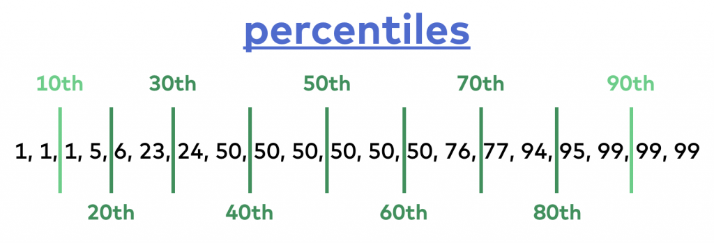
First, have your data in order! The 10th percentile is the value below which 10% of your data points are found. In our case, it’s 1. With a similar method, you can find the 90th percentile (below which 90% of your data is found); in this case, it’s 99. I’ll get back to the exact calculation soon.
Note 1: Did you realize? The median, in fact, is the 50th percentile!
And the fifth calculation that you can run to describe your dataset’s statistical variability… well, it’s not even a calculation. It’s a visual. Put the occurrence of each value in your data set on a bar chart — and you’ll get a histogram.
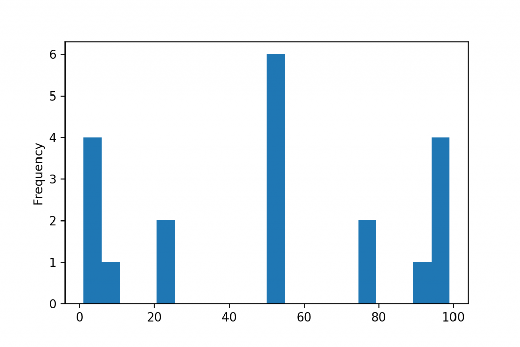
(The x-axis shows the values in the data set — the y-axis shows the number of occurrences of the given value.)
Using a histogram, you can look over the spread and the distribution of your whole data set in one chart. I’ll tell you a bit more about this, as well.
Anyway: this is it!
Having these five weapons in your statistical arsenal (mean, median, standard deviation, percentiles and a histogram) will help you a lot in interpreting your data faster and better. Even if you have not 20 but let’s say 20 million data points… These statistical methods work like a charm on bigger datasets, too.
Statistical variability calculations
Now that you get the essence of the concept, it’s time to dig deeper into how to get (calculate or plot) these variability measures. Let me show you one by one!
Standard Deviation calculation step by step
Again, one of my favorite values to understand the spread of my data is standard deviation.
Many people (especially university students) don’t like it because its calculation seems complicated. But let me tell you that:
a) the calculation is much simpler than it looks at first sight, and
b) once you get the concept, you’ll see that standard deviation is the most intuitive value to describe the variability of your data with only one number.
Let’s see the math!
Take our previous data set:
[1, 1, 1, 5, 6, 23, 24, 50, 50, 50, 50, 50, 50, 76, 77, 94, 95, 99, 99, 99]
STEP #1
Calculate the mean of the dataset! It’s 50.
STEP #2
Take each element and calculate their distance from the mean!
(In stats, these values are called deviation or error.)
E.g.:
1 - 50 = -49
1 - 50 = -49
1 - 50 = -49
5 - 50 = -45
.
.
.
50 - 50 = 0
.
.
.
95 - 50 = 45
99 - 50 = 49
99 - 50 = 49
99 - 50 = 49
STEP #3
Find the square for each value that you got in STEP #2!
(-49)2 = 2401
(-49)2 = 2401
(-49)2 = 2401
(-45)2 = 2025
.
.
.
02 = 0
.
.
.
452 = 2025
492 = 2401
492 = 2401
492 = 2401
STEP #4
Sum the values you got in STEP #3!
2401 + 2401 + 2401 + 2025 + … + 0 + … + 2025 + 2401 + 2401 + 2401 = 25138
STEP #5
Divide the value from STEP #4 with the number of elements (20) in your dataset!
25138 / 20 = 1256.9
(This value is called variance. And by the way, variance is also a well-known variability metric.)
STEP #6
Take the square root of the value in STEP #5!

The end result, the standard deviation, is 35.45.
Standard Deviation Formula
These 6 steps together are often described with one nice formula which is:

This equation is basically the short form of the steps I showed you above.
Note 1: in some standard deviation formulas you’ll see (number-of-elements) - 1 in the denominator (or at step #5) and not only number-of-elements. I don’t want to go deeper into this topic — but know that when you work with a complete dataset (as we normally do in real life data projects) and not with smaller samples, you’ll need the formula that I showed you — and not the one with the (number-of-elements) - 1 denominator. If you want to learn more, Google these phrases: “degrees of freedom” and “sample vs. population.”
Note 2: But if you think a bit more about it: for a million-line dataset, using (number-of-elements) - 1 or simply (number-of-elements) — won’t make any notable difference in the end-result.
Why is Standard Deviation a great statistical variability metric?
Can you remember all the data points in our example data?
No? Don’t worry!
What could you recall, if you only knew that the:
- mean is
50 - median is
50 - standard deviation is
35.45?
Even if you can’t see each data point, you’d still have an intuitive sense of what’s in the data and approximately what its range is, right?
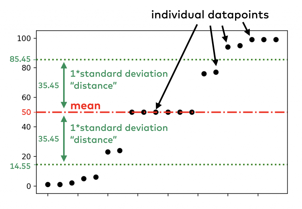
Just in case, here is our dataset again:
[1, 1, 1, 5, 6, 23, 24, 50, 50, 50, 50, 50, 50, 76, 77, 94, 95, 99, 99, 99]
To put all our numbers into context, I’ve created a visual about the relationship between the data, the mean and the standard deviation values:
Now, calculate other popular statistical variability metrics and compare them to the standard deviation!
For instance, the variance of this dataset is 1256.9.
The calculation of variance is basically the same as it was for standard deviation — only without STEP #6, taking the square root. While it’s a similar metric, the problem with this one is that it’s not on the same scale as the mean. So looking at 1256.9 as the measure of the variability of your data is not very intuitive… (For that reason, I don’t really use it.)
What about simpler calculations?
After STEP #2 – calculating the distance for each data point from the mean – why don’t we simply take the mean of the distances/deviations? The answer is simple: because the negative values would offset the positive ones. So the result of that calculation would always be exactly 0. (Just do the calculations and you’ll see!) Not very useful, right?
You could ask: why don’t we use absolute values then? Why is it worth complicating things with squares and square-roots? Now, you are on a better track, because you are thinking of an existing statistical variability metric. It’s called mean absolute deviation and it’s calculated using this formula:

While this is valid, my personal experience is that because it’s less sensitive to extreme values, using this value works less intuitively in the data discovery process than standard deviation — at least with real life data.
By the way, the mean absolute deviation for our example data is: 28.9.
Note: here is the best article that I know of that explains the difference between mean absolute deviation and standard deviation.
So why is standard deviation great for measuring statistical variability?
Because the value it returns is on the same scale as your data points — and for real life data, it returns an intuitive estimate of the spread.
Percentile calculation
The percentile calculation is much easier than standard deviation was.
I’ve already shown you the concept:
You have to order your data points! And then the 10th, 20th, 30th, etc. percentiles are the values below which 10%, 20%, 30%, etc. of your data points are found.
As I said, I prefer to use the 10th and 90th percentiles.
Using percentiles rather than simple minimum or maximum values, you can see the range of your data – excluding extreme values.
In our example:
- the 10th percentile is
1. - the 90th percentile is
99.
Checking the percentile values is useful when you have a more or less consistent dataset with a few extreme outliers. (Which is also very typical in real life data science projects…) Of course, depending on your data, you can experiment with using different percentiles. E.g. 1st and 99th percentile instead of 10th and 90th.
Let’s see how the percentile calculation works!
I’ll show you the 10th — and you can apply the process for whatever percentile you choose.
STEP #1
Sort your data in ascending order!
STEP #2
Count the number of elements!
It’s 20.
STEP #3
“Cut” your list after 10% of the elements.
So if you have 100 elements, your “cut” will be between the 10th and 11th elements. In our case, it’s between the 2nd and 3rd elements.
STEP #4
If the cut falls exactly onto a value in the list (it’s less common in real life projects) — or it falls between two values that are the same (like in our example), you are done and you’ve got your 10th percentile.
In our case, it’s 1.
STEP #5
If you are less lucky, you have to take the two values below and above your cut and calculate the weighted mean of them.
E.g. if our list were:
[1, 1, 2, 5, 6, 23, 24, 50, 50, 50, 50, 50, 50, 76, 77, 94, 95, 99, 99, 99]
then our 10th percentile would fall between 1 and 2.
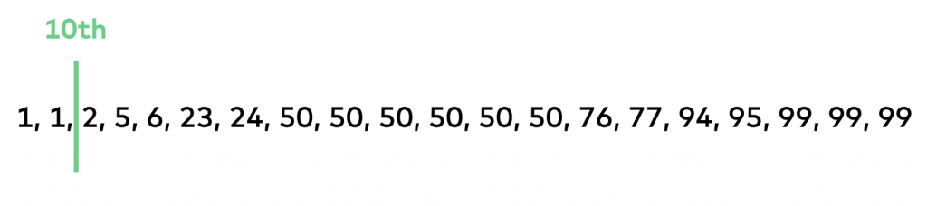
Since we are talking about the 10th percentile, we would give 10% weight to 1 and 90% weight to 2. Which leads to the calculation of: (1*10 + 90*2)/100 = 1.9.
So the 10th percentile of this set would be 1.9.
Note: there are different percentile calculation methods that will lead to slightly different results. In real data science projects, it makes only a tiny difference which one you choose. Here, I showed you the one that’s implemented in most Python modules and packages.
Histograms
Histograms are pretty easy to understand.
All you have to do is to count the occurrence of each value you have in your data and put that on a bar chart.
For our 20-element example data, this is what you’ll get:
Simple, visual, intuitive. That’s why I love histograms.
As they say, “one picture is worth a thousand words.”
Well, of course, using a histogram can be trickier when you have 10,000,000 different data points in your dataset. In that case, you’ll have to group your values into ranges… and picking the best grouping method is not always easy.
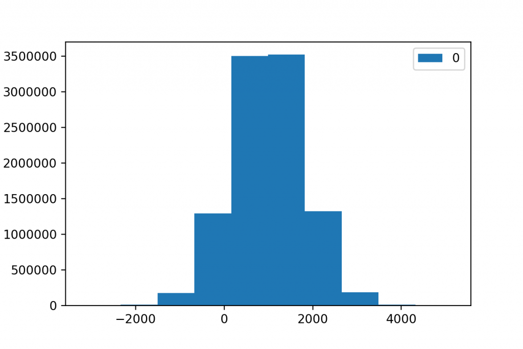
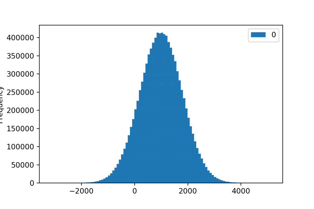
E.g. Here are three histograms for the very same 10,000,000 datapoints.
When we group our data into 10 buckets (or “bins”):
When we have 100 buckets:
And when the number of buckets is 1,000:
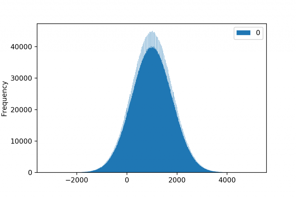
Of course, in this case, the 100-bucket version seems to be the winning visualization. It nicely shows the shape of the distribution… But believe me: choosing the right ranges and the right number of groups for your histogram quite often takes some serious brain work.
Anyway, I’ll write a more in-depth article about histograms on the Data36 blog later.
Conclusion – statistical variability is important!
Using statistical averages and statistical variability metrics together is an excellent way of compressing your huge datasets into a few meaningful numbers. It can be especially useful throughout the data discovery phase of your data projects.
My favorite ways to measure and describe statistical variability are:
- standard deviation
- percentiles
- histograms
Using these three together will give you a very good overall understanding about the spread of your data — without a lot of effort.
- If you want to learn more about how to become a data scientist, take my 50-minute video course: How to Become a Data Scientist. (It’s free!)
- Also check out my 6-week online course: The Junior Data Scientist’s First Month video course.
Cheers,
Tomi Mester
Cheers,
Tomi Mester