
Scatter plots are frequently used in data science and machine learning projects. In this pandas tutorial, I’ll show you two simple methods to plot one. Both solutions will be equally useful and quick:
- one will be using pandas (more precisely:
pandas.plot.scatter()) - the other one using matplotlib (
matplotlib.pyplot.scatter())
Let’s see them — and as usual: I’ll guide you through step by step.
Note: If you don’t know anything about pandas (or Python), you might want to start here:
- Python libraries and packages for Data Scientists
- Learn Python from Scratch
- Pandas Tutorial 1 (Basics)
- Pandas Tutorial 2 (Aggregation and grouping)
- Pandas Tutorial 3 (Data Formatting)
- Pandas Tutorial 4 (Plotting in pandas: Bar Chart, Line Chart, Histogram)
Download the code base!
This is a hands-on tutorial, so it’s best if you do the coding part with me!
You can also find the whole code base for this article (in Jupyter Notebook format) here: Scatter plot in Python.
You can download it from: here.
What is a scatter plot? And what is it good for?
Scatter plots are used to visualize the relationship between two (or sometimes three) variables in a data set. The idea is simple:
- you take a data point,
- you take two of its variables,
- the y-axis shows the value of the first variable,
- the x-axis shows the value of the second variable
Following this concept, you display each and every datapoint in your dataset. You’ll get something like this:

Boom! This is a scatter plot. At least, the easiest (and most common) example of it.
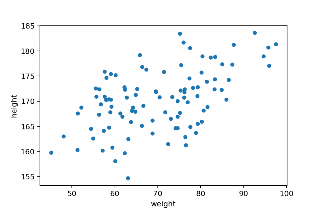
This particular scatter plot shows the relationship between the height and weight of people from a random sample. Again:
- y-axis shows the height
- x-axis shows the weight
- and each blue dot represents a person in this dataset
So, for instance, this person’s (highlighted with red) weight and height is 66.5 kg and 169 cm.

How to read a scatter plot?
Scatter plots play an important role in data science – especially in building/prototyping machine learning models. Looking at the chart above, you can immediately tell that there’s a strong correlation between weight and height, right? As we discussed in my linear regression article, you can even fit a trend line (a.k.a. regression line) to this data set and try to describe this relationship with a mathematical formula.
Something like this:

Note: this article is not about regression machine learning models, but if you want to get started with that, go here: Linear Regression in Python using numpy + polyfit (with code base)
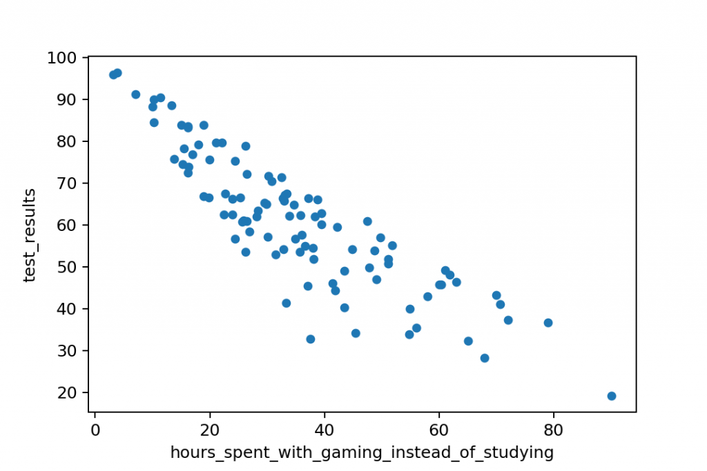
This above is called a positive correlation. The greater is the height value, the greater is the expected weight value, too. (Of course, this is a generalization of the data set. There are always exceptions and outliers!)
But it’s also possible that you’ll get a negative correlation:
And in real-life data science projects, you’ll see no correlation often, too:
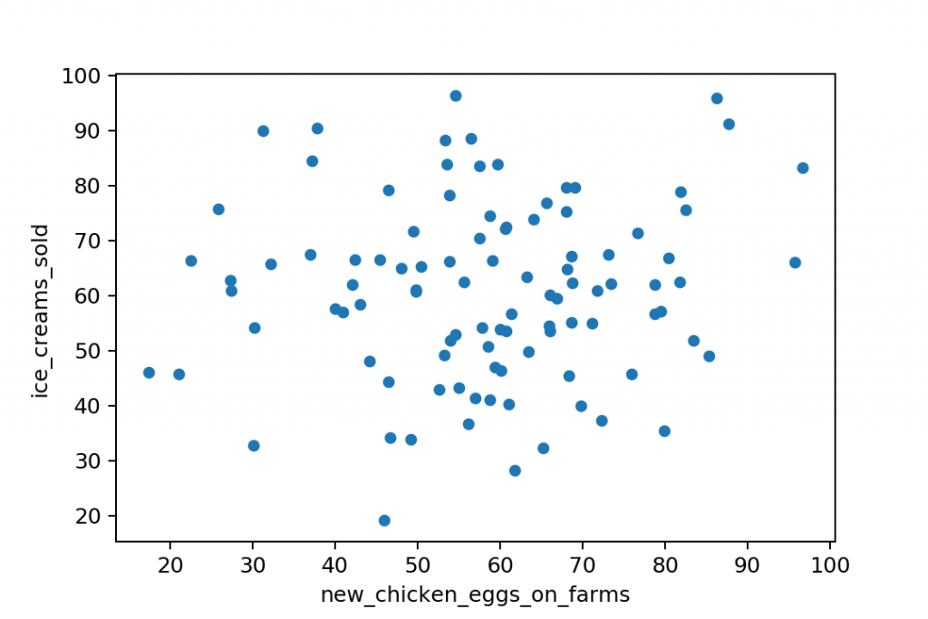
Anyway: if you see a sign of positive or negative correlation between two variables in a data science project, that’s a good indicator that you found something interesting — something that’s worth digging deeper into. Well, in 99% of cases it will turn out to be either a triviality, or a coincidence. But in the remaining 1%, you might find gold!
Okay, I hope I set your expectations about scatter plots high enough.
It’s time to see how to create one in Python!
Scatter plot in pandas and matplotlib
As I mentioned before, I’ll show you two ways to create your scatter plot.
You’ll see here the Python code for:
- a pandas scatter plot
and - a matplotlib scatter plot
The two solutions are fairly similar, the whole process is ~90% the same… The only difference is in the last few lines of code.
Note: By the way, I prefer the matplotlib solution because I find it a bit more transparent.
I’ll guide you through these 4 steps:
- Importing pandas, numpy and matplotlib
- Getting the data
- Preparing the data
- Plotting a scatter plot
Step #1: Import pandas, numpy and matplotlib!
Just as we have done in the histogram article, as a first step, you’ll have to import the libraries you’ll use. And you’ll also have to make a small tweak in your Jupyter environment.
import numpy as np
import pandas as pd
import matplotlib.pyplot as plt
%matplotlib inline
The first two lines will import pandas and numpy.
The third line will import the pyplot from matplotlib — also, we will refer to it as plt.
And %matplotlib inline sets your environment so you can directly plot charts into your Jupyter Notebook!
Great!
Step #2: Get the data!
Well, in real data science projects, getting the data would be a bit harder. You should read .csv files or SQL tables into your Python environment. But this tutorial’s focus is not on learning that — so you can take the lazy way and use the dataset I’ll provide for you here.
Note: What’s in the data? This is the modified version of the dataset that we used in the pandas histogram article — the heights and weights of our hypothetical gym’s members.
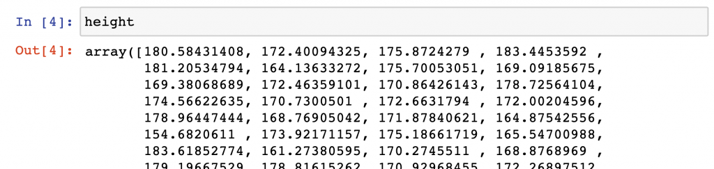
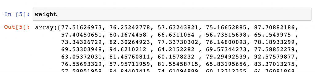
np.random.seed(0)
mu = 170 #mean
sigma = 6 #stddev
sample = 100
height = np.random.normal(mu, sigma, sample)
weight = (height-100) * np.random.uniform(0.75, 1.25, 100)
This is a random generator, by the way, that generates 100 height and 100 weight values — in numpy array format. By using the np.random.seed(0) line, we also made sure you’ll be able to work with the exact same data points that I do in this article.
Note: For now, you don’t have to know line by line what’s going on here. (I’ll write a separate article about how numpy.random works.)
In the next step, we will push these data sets into pandas dataframes.
Step #3: Prepare the data!
Again, preparing, cleaning and formatting the data is a painful and time consuming process in real-life data science projects. But in this tutorial, we are lucky, everything is prepared – the data is clean – so you can push your height and weight data sets directly into a pandas dataframe (called gym) by running this one line of code:
gym = pd.DataFrame({'height': height, 'weight': weight})
Note: If you want to experience the complexity of a true-to-life data science project, go and check out my 6-week course: The Junior Data Scientist’s First Month!
Your gym dataframe should look like this.
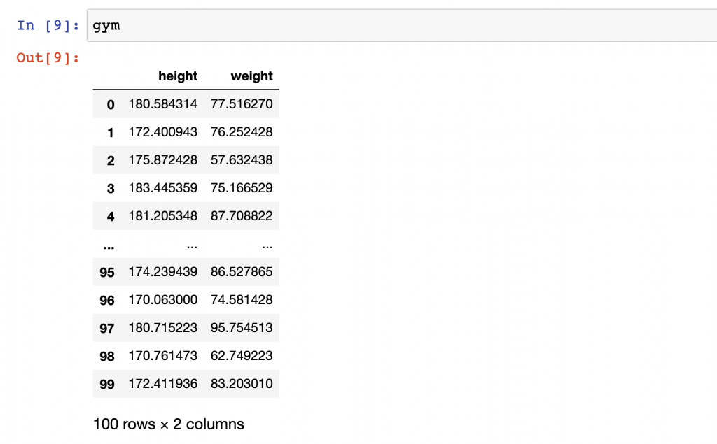
Perfect: ready for putting it on a scatter plot!
Step #4a: Pandas scatter plot
Okay, all set, we have the gym dataframe. Let’s create a pandas scatter plot!
Now, this is only one line of code and it’s pretty similar to what we had for bar charts, line charts and histograms in pandas…
It starts with: gym.plot …and then you simply have to define the chart type that you want to plot, which is scatter(). But when plotting a scatter plot in pandas, you’ll always have to specify the x and y values as parameters, too. (This could seem unusual because for bar and line charts, you didn’t have to do anything similar to this.)
So the final line of code will be:
gym.plot.scatter(x = 'weight', y = 'height')
The x and y values – by definition – have to come from the gym dataframe, so you have to refer to the column names: 'weight' and 'height'!
A quick comment: Watch out for all the apostrophes! I know from my live workshops that the syntax might seem tricky at first. But you’ll get used to it after your 5th or 6th scatter plot, I promise! 🙂
That’s it! You have plotted a scatter plot in pandas!

Step #4b: Matplotlib scatter plot
Here’s an alternative solution for the last step. In this one, we will use the matplotlib library instead of pandas. (Although, I have to mention here that the pandas solution I showed you is actually built on matplotlib’s code.)
In my opinion, this solution is a bit more elegant. But from a technical standpoint — and for results — both solutions are equally great.
Anyway, type and run these three lines:
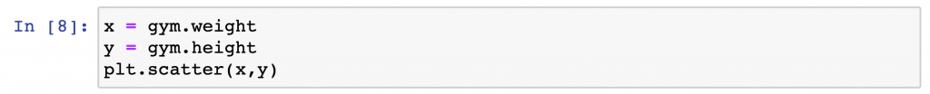
x = gym.weight
y = gym.height
plt.scatter(x,y)
x = gym.weight
This line defines what values will be displayed on the x-axis of the scatter plot. It’s theweightcolumn again from thegymdataset. (Note: This is in pandas Series format… But in this specific case, I could have added the original numpy array, too.)y = gym.height
On the y-axis we want to display thegym.heightvalues. (This is in pandas Series format, too!)plt.scatter(x,y)
And then this line does the plotting. Remember, you setpltat the very beginning of our Jupyter notebook (import matplotlib.pyplot as plt) — and sopltrefers tomatplotlib.pyplot! And thexandyvalues are parameters that have been defined in the previous two lines.
Again: this is slightly different (and in my opinion slightly nicer) syntax than with pandas.
But the result is exactly the same.
Conclusion
This is how you make a scatter plot in pandas and/or in matplotlib. I think it’s fairly easy and I hope you think the same. If you haven’t done so yet, check out my Python histogram tutorial, too! If you have any questions, drop me an email and I’ll help!
- If you want to learn more about how to become a data scientist, take my 50-minute video course: How to Become a Data Scientist. (It’s free!)
- Also check out my 6-week online course: The Junior Data Scientist’s First Month video course.
Cheers,
Tomi Mester
Cheers,
Tomi Mester