
This article is about dating and data science!
Please welcome our guest author, Amy Birdee, who has done multiple data science hobby projects recently and built a truly awesome portfolio. Amy’s Github is just the perfect example of how one should demonstrate their skills as an aspiring data scientist… No surprise that Amy got hired as a Lead Data Analyst recently. Amy’s guest post is about how she has done exploratory data analysis using the OkCupid Dataset. Enjoy!
This article follows on from my previous article on exploring and cleaning the OkCupid dataset. In this one, I’ll analyze the data and it will be used to create three different types of chart:
- a histogram
- a bar chart
- and a pie chart
We’ll use Python, pandas and matplotlib to do so!
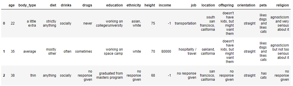
The dataset after data cleaning
To start with, let’s remind ourselves of the dataset we are working with using the .head(3) command.
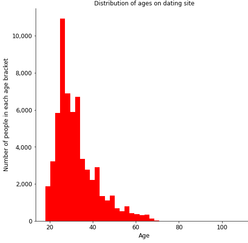
The data have already been cleaned, so let’s take a look at one of the numerical features in the dataset and create a histogram.
Histogram: exploring the data via visualization
Histograms are great for showing the distribution within a data series. They group the data into pre-defined buckets or bins and show the shape of the data. Below is the code to create a histogram for the age column in the OkCupid dataset.
#checking age distribution - shows a right skew
plt.figure(figsize = (8,8))
ax = plt.subplot()

dating['age'].hist(bins = 40, color = 'red')
#removing chart borders
ax.spines['top'].set_visible(False)
ax.spines['right'].set_visible(False)

#function to add comma separator to labels. Function takes tick label and tick position
def comma(x, pos):
    return format(x, ",.0f")

#this code adds a comma separator to the y tick marks
ax.yaxis.set_major_formatter(tcr.FuncFormatter(comma))

plt.xlabel('Age', fontsize = 12)
plt.ylabel('Number of people in each age bracket', fontsize = 12)
plt.tick_params(axis = 'x', labelsize = 12)
plt.tick_params(axis = 'y', labelsize = 12)

plt.title('Distribution of ages on dating site', fontsize = 12)
plt.grid(None)
plt.savefig('Age - histogram', bbox_inches = 'tight')
Histogram Python code explained
Let’s break down the code. In the first line below, we are creating a figure for the histogram and also stating the size. In the second line we are creating a set of axes for the plot.
plt.figure(figsize = (8, 8))
ax = plt.subplot()
Following this, we select our data – we want the age column from the dating data frame. The chart type is a histogram (denoted below by .hist()) and we have selected 40 bins (this can be any number depending on how many data points you want each bin to contain) and stated that the colours of the bars should be red. This is actually enough code to create the histogram (see output below), and we could stop here, but we want to make sure it’s clear for anyone reading the chart and so we will also add some labels and formatting.
dating[‘age’].hist(bins = 40, color = ‘red’)
Histogram formatting: borders, labels and ticks
First, let’s remove the top and right borders so that we’re just left with the X and Y-axis. This is done with the following code.
ax.spines[‘top’].set_visible(False)
ax.spines[‘right’].set_visible(False)
The dataset consists of around 60,000 members and so the Y-axis on the chart will definitely go into the thousands. In order to make the chart more visually appealing, we can use a comma separator for the Y-axis data labels. This is what the code below does.
The first part is a function which takes the tick label (x) and the tick position (pos) and returns the tick label to zero decimal places, formatted by a comma separator.
def comma(x, pos):
    return format(x, ",.0f")
This function is then applied to the Y-axis using Matplotlib’s ticker.FuncFormatter() command which was imported at the start of the Python script in part 1.
ax.yaxis.set_major_formatter(tcr.FuncFormatter(comma))
Now that the labels have been formatted we can label the axes as shown by the first two lines of code below – we have ‘Age’ on the X-axis and ‘Number of people’ on the Y-axis. The next two lines specify the font size for the X and Y labels and sets these to 12.
plt.xlabel('Age', fontsize = 12)
plt.ylabel('Number of people in each age bracket', fontsize = 12)
plt.tick_params(axis = 'x', labelsize = 12)
plt.tick_params(axis = 'y', labelsize = 12)
Our chart is looking a little better!
Histogram formatting: title, gridlines and savefig()
Finally, we can give our chart a title, remove the gridlines (this is just personal preference) and save the figure. The bbox_inches = ‘tight’ command just removes any extra white space around the chart and so it takes up less space if you import it into PowerPoint for example.
plt.title('Distribution of ages on dating site', fontsize = 12)
plt.grid(None)
plt.savefig('Age - histogram', bbox_inches = 'tight')
And voila! We have our histogram! As you can see, it’s clearly labelled and easy to read, the Y-axis labels are nicely formatted, and it’s ready to be included in a presentation to show that the age distribution of members of the OkCupid dating site has a right skew.
A similar approach can be taken for the other numerical variables – height and income – but rather than do that here, we’re now moving onto the categorical variables and creating a bar chart – fun!
Bar chart: comparing groups and segments
In the bar chart, we’re going to plot the diets of the dating site members. As we saw in the previous article, the .describe() command showed that we had 18 unique variables for this column. Let’s take a look at these by grouping the data as shown by the below code:
diet = dating
diet = diet.groupby('diet').size()
diet = diet.sort_values(ascending = False)
diet = diet.to_frame().reset_index()
diet = diet.rename(columns = {0: 'diet_count'})
Some explanation:
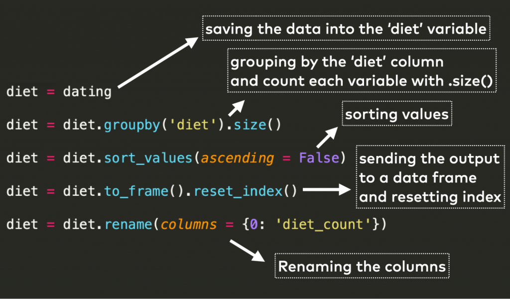
Once the data have been grouped, we can use diet.head() to view the first five rows of the output:
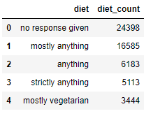
Before the bar chart: reduce the number of segments!
There are similarities between some of these responses e.g. ‘mostly anything’, ‘anything’, and ‘strictly anything’ – that’s a lot of anything!
Including all of these will likely make our chart look cluttered and it wouldn’t be very useful if it’s difficult to read. So the next part of the code assigns a single variable to those which are very similar. This is done by using a dictionary, as follows.
diet_dictionary = {'no response given': 'No response',
    'mostly anything': 'Anything',
    'anything': 'Anything',
    'strictly anything': 'Anything',
    'mostly vegetarian': 'Vegetarian',
    'mostly other': 'Other',
    'strictly vegetarian': 'Vegetarian',
    'vegetarian': 'Vegetarian',
    'strictly other': 'Other',
    'mostly vegan': 'Vegan',
    'other': 'Other',
    'strictly vegan': 'Vegan',
    'vegan': 'Vegan',
    'mostly kosher': 'Kosher',
    'mostly halal': 'Halal',
    'strictly kosher': 'Kosher',
    'strictly halal': 'Halal',
    'kosher': 'Kosher',
    'halal': 'Halal'}
Once this is done, the dictionary keys ‘mostly anything’, ‘anything’ and ‘strictly anything’ all store the same value – ‘Anything’.
We can now add a new column called diet_group to the diet data frame and map this dictionary to it as shown below.
diet['diet_group'] = diet['diet'].map(diet_dictionary)
This gives the following new data frame, which we can use to create the bar chart.
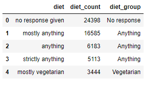
But first, we need to do another groupby(), this time using the new diet_group column.
diet_group = diet.groupby('diet_group').diet_count.sum().sort_values(ascending = False).to_frame().reset_index()
This code is very similar to the previous groupby() but instead of .size(), we use .sum() to sum up all the value counts in the diet_count column. We end up with the below data frame.
Only 7 different categories – much better than 18!
Bar chart: time to visualize!
We can now create the bar chart using the below code.
#plotting diet on a bar chart
plt.figure(figsize = (6, 6))
ax = plt.subplot()

plt.bar(diet_group['diet_group'], diet_group['diet_count'], color = 'red')

#removing chart borders
ax.spines['top'].set_visible(False)
ax.spines['right'].set_visible(False)

#adding data labels for bars
bars = plt.bar(diet_group['diet_group'], diet_group['diet_count'], color = 'red')

for bar in bars:
    yval = bar.get_height()
    #the '{:,}' command adds a thousand separator to the labels
    ax.annotate('{:,}'.format(yval),
    xy = (bar.get_x() + bar.get_width() / 2, yval),
    #shows label position on x and y axis
    xytext = (0, 3),
    textcoords = 'offset points', ha = 'center', va = 'bottom', fontsize = 12)

#this code adds a comma separator to the y tick marks using the previously defined function
ax.yaxis.set_major_formatter(tcr.FuncFormatter(comma))

plt.xticks(rotation = 90)
plt.xlabel('Diet', fontsize = 12)
plt.ylabel('Number of site members', fontsize = 12)
plt.title('Diets of dating site members', fontsize = 12)
plt.tick_params(axis = 'x', labelsize = 12)
plt.tick_params(axis = 'y', labelsize = 12)

plt.tight_layout()
plt.savefig('Diet')
A lot of this code will already be familiar from creating the histogram so I’ll just cover the new code here.
The below code creates the bar chart:
plt.bar(diet_group['diet_group'], diet_group['diet_count'], color = 'red')
It takes the diet_group column from the diet_group table as the X value and the diet_count column as the Y value.
We can use a for loop to label each bar in the chart, which is what the following code does. First we assign the bar chart to a variable called bars…
bars = plt.bar(diet_group['diet_group'], diet_group['diet_count'], color = 'red')
…and then we create the loop:
for bar in bars:
    yval = bar.get_height()
    ax.annotate('{:,}'.format(yval),
    xy = (bar.get_x() + bar.get_width() / 2, yval),
    xytext = (0, 3),
    textcoords = 'offset points', ha = 'center', va = 'bottom', fontsize = 12)
Here is a description of what the loop is doing:
for bar in bars:–» The for loop is initiated for every bar in the bar chart…yval = bar.get_height()–» Let’s store the height of each bar in theyvalvariableax.annotate('{:,}'.format(yval)–» Annotate each bar withyval(the variable we set in the previous line) and format each value with a comma separatorxy = (bar.get_x() + bar.get_width() / 2, yval)–» The variablexyrepresents the point to annotate, in this case, annotate the centre of each bar withyvalxytext = (0, 3)–» The variablexytextshows the coordinates for each label with the first value representing the position above the bar along the X-axis and the second value showing the position above the bar on the Y-axistextcoords = 'offset points', ha = 'center', va = 'bottom', fontsize = 12)–» The variabletextcoordsshows how to position the text with the horizontal alignment being'center’and the vertical alignment being‘bottom’.
This gives the following bar chart, which is looking pretty good:

Now let’s use a different data column to create a pie chart!
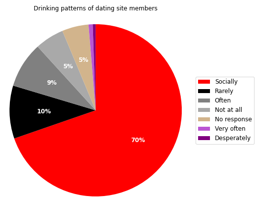
Pie chart: proportion of patterns
To create the pie chart, we’re going to use the drinks column of the data frame which shows the drinking habits of OkCupid members. To start off, let’s group by this column to see the column values. The code is very similar to that shown earlier and we’re saving the .groupby() formula to a variable called drinks.
drinks = dating.groupby('drinks').size().sort_values(ascending = False).to_frame().reset_index().rename(columns = {0: 'count_of_drinks'})
This gives us the following data frame – we can see that 322 members drink ‘desperately’… (Probably best not to ask…)

Pie chart: Python code
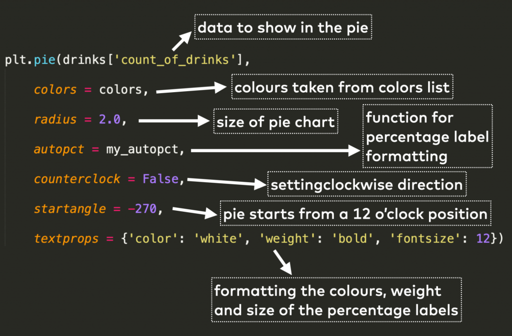
Ok, so now to the pie chart. Here is the code.
def my_autopct(pct):
    return ('%.0f%%' % pct) if pct > 1 else ''

drinks_labels = ['Socially', 'Rarely', 'Often', 'Not at all', 'No response', 'Very often', 'Desperately']

colors = ['red', 'black', 'grey','darkgrey', 'tan', 'mediumorchid', 'purple']

plt.pie(drinks['count_of_drinks'], colors = colors, radius = 2.0, autopct = my_autopct, counterclock = False, startangle = -270, textprops = {'color': 'white', 'weight': 'bold', 'fontsize': 12})

#bbox_to_anchor moves the legend around depending on the numbers fed in
plt.legend(labels = drinks_labels, bbox_to_anchor = (2, 0.5), loc = 'right', fontsize = 12)

#the y = 1.4 shifts the title up above the chart
plt.title('Drinking patterns of dating site members', y = 1.4, fontsize = 12)
plt.savefig('drinking_patterns', bbox_inches = 'tight')
Pie chart code… let’s break it down!
Since a pie chart shows proportions, we will want to label these for easier readability. The function at the start of the code determines how these labels should be formatted. That was:
def my_autopct(pct):
    return ('%.0f%%' % pct) if pct > 1 else ''
The function takes a percent value and returns the percentage to zero decimal places but only if the percentage value is greater than 1% (this is to prevent labels from overlapping if there are many small segments in the pie chart). If the percentage is less than 1%, that segment is left without a label.
Next we define our legend labels and colours. Since there were only a few variables, I put these into a list as follows:
drinks_labels = ['Socially', 'Rarely', 'Often', 'Not at all', 'No response', 'Very often', 'Desperately']

colors = ['red', 'black', 'grey','darkgrey', 'tan', 'mediumorchid', 'purple']
Make sure you have the same number of colours as label values — and note that Python uses the American spelling for the word ‘colour’!
Now we can create the pie chart with the following code.
plt.pie(drinks['count_of_drinks'],
    colors = colors,
    radius = 2.0,
    autopct = my_autopct,
    counterclock = False,
    startangle = -270,
    textprops = {'color': 'white', 'weight': 'bold', 'fontsize': 12})
Some explanation on what’s going on here:
We’re nearly there, we just need to create the legend, which is done with the following code.
plt.legend(labels = drinks_labels, bbox_to_anchor = (2, 0.5), loc = 'right', fontsize = 12)
We have already defined our legend labels so we can insert them here using labels = drinks_labels.
bbox_to_anchor determines the position of the legend in terms of X and Y coordinates and we have specified that the location should be to the right of the pie chart.
…
And here we have our chart – we can see that most members on the site are social drinkers:
Conclusion
Obviously we’ve only just scratched the surface of the data set here and there’s still a huge amount to explore! If you’re just starting out on your data science journey, I hope you learned something new in terms of data cleaning or chart formatting through this and the previous article. If you followed the articles and did the work on your own laptops then I encourage you to continue and explore the other data columns! Or you can use this as a guide for your own hobby projects.
For more information on creating visualisations, Tomi has a couple of great articles on creating scatter plots and histograms.
And if you haven’t done so already, if you are serious about a career in data science, then I strongly encourage you to take the six-week Junior Data Scientist’s First Month course – I would never have been able to start a hobby project without it! Thank you for reading!
Cheers,
Amy