

Our guest author today is Joachim Schork from Statistics Globe. I asked Joachim to give us an intro to a data language that we haven’t covered so far here on Data36. That’s R… Or using its official name: the R Programming Language. In this article, Joachim will guide us through the fundamentals — and you’ll learn what you can achieve with some basic R. You feel free to copy-paste the code from this article and follow along the process on your computer. And don’t worry if you don’t get everything 100% first. This article is to demonstrate R — but if you want to actually learn it from scratch, I encourage you to check out Joachim’s blog and his YouTube channel that are linked at the end of this article.
The R programming language is a powerful tool that is getting more and more common in the fields of statistics and social sciences.
In this article, I’ll introduce some basic features of the R programming language, and I’ll explain how to use R to manipulate, analyze, and visualize your data.
Let’s first dive into some background information about the R programming language!
Background Information about the R Programming Language
R was developed by Ross Ihaka and Robert Gentleman in 1995 and is based on the S programming language. The R software is open source, i.e. freely available for use, development, and distribution.
Even though the basic installation of the R programming language provides many powerful functions, its main strength comes from the many add-on packages that have been developed by the R programming community. As of June 2021, more than 17,000 packages are available on the Comprehensive R Archive Network (CRAN).
The popularity of R is constantly increasing, and especially in the fields of statistics and social sciences R is becoming the major software tool.
In the following sections of this article, I’ll show some useful ways to use R in practice, including example data and example R code that you can run yourself on your own machine. So keep on reading!
Data Manipulation in R
A major strength of the R programming language is the easy-to-use and comprehensive features when handling and manipulating data sets.
For illustration, we will create our own data set. We will also use this data set in the later sections of this article, so make sure to understand the structure of our data!
If you don’t have R and RStudio installed yet, just follow Tomi’s installation guide here.
Note: for now, just follow my lead, generate the data — if you don’t get everything 100% at first, don’t worry, it’ll all fall into place later!
Let’s generate some data!
As the first step, we have to specify the sample size of our data. The following R code creates a new data object called N, which contains the value 1000 (i.e. our sample size).
N <- 1000 # Specify sample size
Since we want to create some randomly distributed data later on, we also should set a random seed:
(Note: a random seed initializes a pseudorandom number generator and hence ensures the reproducibility of our code)
set.seed(1357531) # Set random seed for reproducibility
Next, we generate some randomly distributed variables. In the following R code, we use the rnorm function to create normally distributed variables, the runif function to create a uniformly distributed variable, the rpois function to create a Poisson distribution, and the rbinom function to create a binomial group indicator:
x1 <- rnorm(N)    # Create random variables
x2 <- runif(N) + 0.25 * x1
x3 <- rpois(N, 3) - 0.3 * x1 + 0.5 * x2
y <- rnorm(N, 2, 3) +  5 * x1 + 2 * x2 + 0.5 * x3
group <- LETTERS[rbinom(N, 1, prob = rank(rank(y) * rank(- x1)) / N) + 1]
Put the data in a data frame!
In the next step, we combine all these variables in a data frame object by using the data.frame function:
data <- data.frame(x1, x2, x3, y, group) # Store all variables in data frame
Then, we can use the head function to print the first six rows of our example data:
head(data) # Print head of data frame
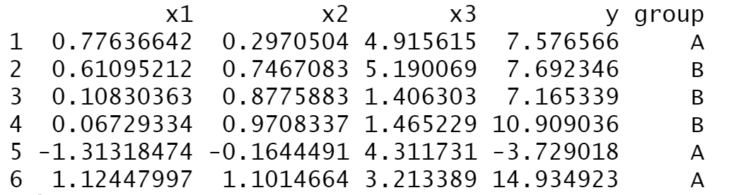
The previous output of the RStudio console shows the structure of our example data. As you can see, our data contains three numerical predictor variables called x1, x2, and x3, as well as a target variable y and a group indicator.
Clean up the RStudio workspace!
Finally, we can clear our RStudio workspace of everything but our example data frame by using the rm, setdiff, and ls functions:
rm(list = setdiff(ls(), "data")) # Clear unnecessary objects from workspace
After running the previous R code, only our example data frame is kept in the workspace.
Ready for data analysis with R!
As you have seen in the previous section, the R programming language provides many useful functions to create and manipulate data objects. Of course, the functions shown in this section could only give a brief overview. However, at this point you should have a basic idea on how to deal with data sets in R.
We are ready to analyze our data!
Descriptive Statistics in R
The summary function
The following R syntax demonstrates how to calculate some basic summary statistics using the R programming language.
The easiest way to do this is by applying the summary function to a data set:
summary(data) # Summary statistics of data frame
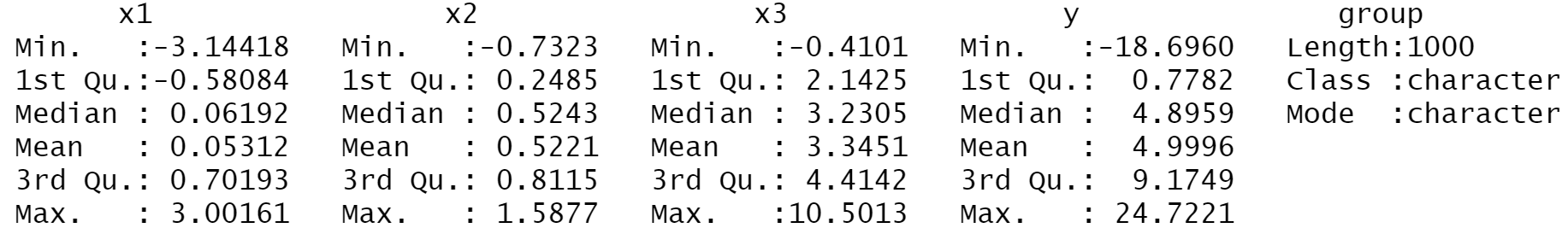
The previous output shows some of the most important metrics when analyzing a data set, i.e. the minimum, the 1st quantile, the median, the mean, the 3rd quantile, and the maximum of each column in our data set. This should already give a good idea how the structure of the data looks.
The cor function
Next, we can use the cor function to return the correlation matrix of our data, i.e. a table showing the correlation coefficients between all numeric variables of a data set. Note that we have to subset the first four columns of our data, since our grouping indication (i.e. the fifth column) is not numeric.
cor(data[ , 1:4]) # Correlation matrix
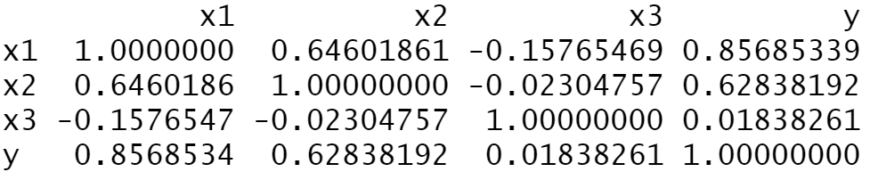
As you can see based on the previous output, the variables contained in our data set are heavily correlated.
The aggregate function
We can also analyze our data by group using the aggregate function. The following R code computes the mean by group for the target variable y:
aggregate(y ~ group, data, mean) # Descriptive statistics by group
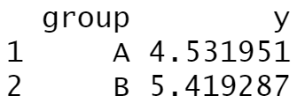
The mean of the variable y in group A is 4.531951 and the mean in group B is 5.419287.
As you have seen so far, we can use the R programming language to create basic descriptive statistics of a data set. However, we can also use R to perform more complex analyses.
The lm function
The following R code shows how to use the lm function and the summary function (note that we have already used the summary function before) to estimate a linear regression model:
summary(lm(y ~ ., data)) # Estimate linear regression model
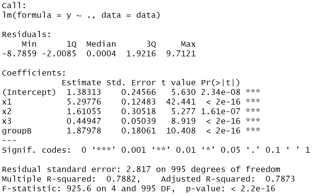
The previous output shows that all predictor variables are significantly related to our outcome variable y. Furthermore, you can see additional statistical metrics such as the residual standard error, the degrees of freedom, multiple and adjusted R-squared, the F-statistic, as well as the p-value of our model.
I don’t want to go into too much detail here, since this is supposed to be an introductory guide. However, in case you want to read more about statistical methods using the R programming language, you may have a look here.
In the next section, I’ll show you another strength of the R programming language – data visualization!
Data Visualization in R
The following section shows an introduction on how to draw graphics using the R programming language.
The basic installation of R is already quite powerful when it comes to data visualization. However, the most popular and important framework for graphics in R is provided by the ggplot2 package.
If we want to create graphics with the ggplot2 package, it is preferable to have our data frame in long format, i.e. we first have to do another data manipulation step.
Note: Our previously created wide data set consists of one row for each observation. In contrast, a long data set contains an ID variable (or variables) that groups the values corresponding to an observation.
To convert our wide data frame to long format, we can use the functions of the tidyverse – another powerful add-on package for the R programming language.
Install tidyverse and ggplot2!
In order to use the functions of the tidyverse package, we first have to install and load tidyverse to R:
install.packages("tidyverse")   # Install & load tidyverse package
library("tidyverse")
In the next step, we can apply the pivot_longer function provided by the tidyverse package to transform our data to long format:
data_long <- as.data.frame(   # Convert data frame to long format
pivot_longer(data = data,
    cols = c("x1", "x2", "x3", "y")))
head(data_long)   # Print head of long data frame

The previous output illustrates the structure of our new data set.
Now, we can continue with the visualization of our data. For this, we have to install and load the ggplot2 package:
install.packages("ggplot2")   # Install & load ggplot2 package
library("ggplot2")
Visualize with ggplot2!
The ggplot2 package provides a different function for each type of plot. For instance, the geom_density function is used to create density plots, the geom_boxplot function is used to create boxplots, and the geom_point function is used to create scatterplots. However, the basic structure of the ggplot2 code is always the same.
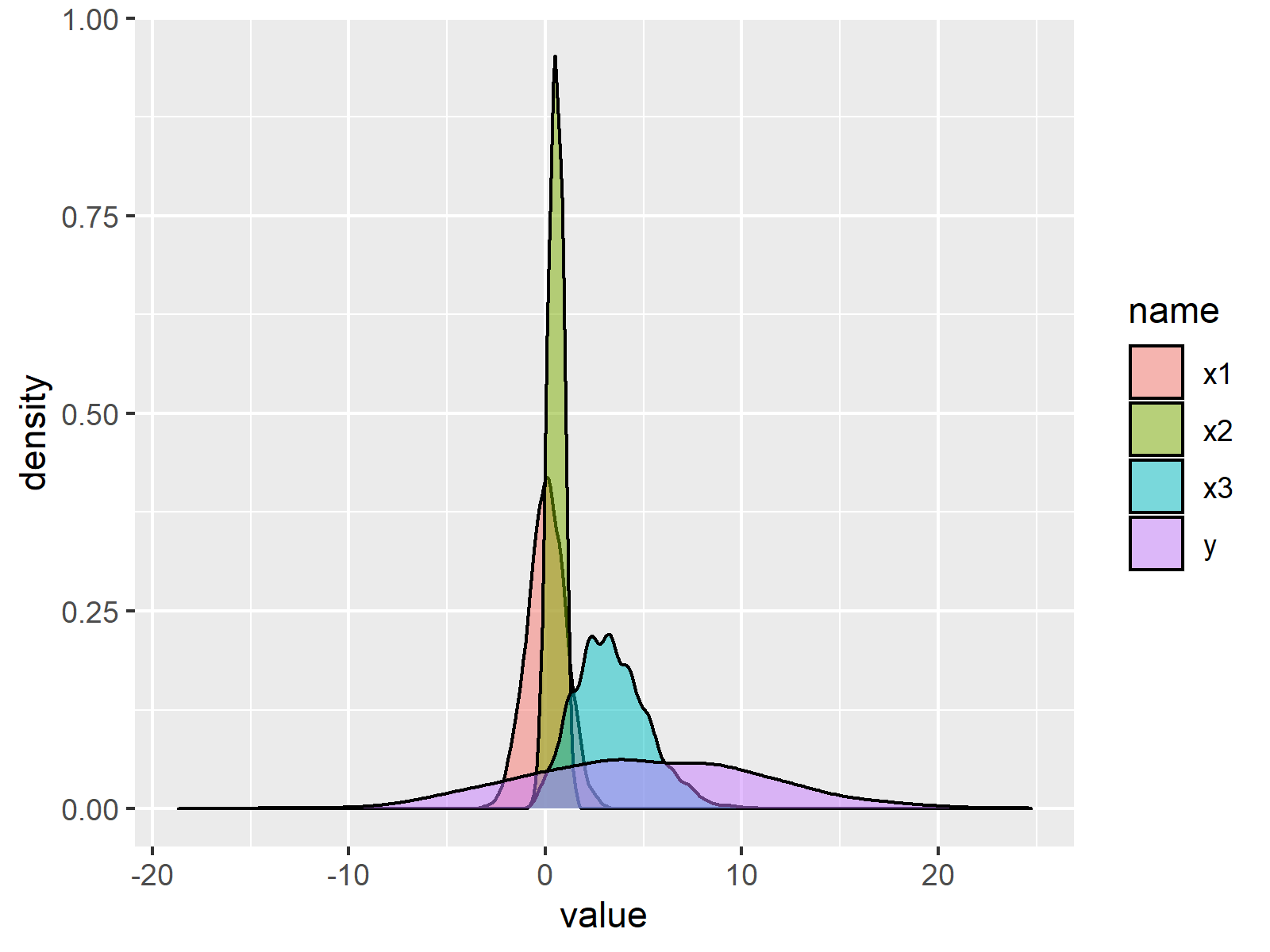
The following R code creates a graphic containing a transparent density for each of our numerical variables:
ggp_density <- ggplot(data_long,   # Create density plot
    aes(x = value,
    fill = name)) +
geom_density(alpha = 0.5)
ggp_density
The following syntax draws a grouped boxplot of our four numerical variables:
ggp_boxplot <- ggplot(data_long,   # Create boxplot
    aes(x = name,
    y = value,
    color = group)) +
geom_boxplot()
ggp_boxplot

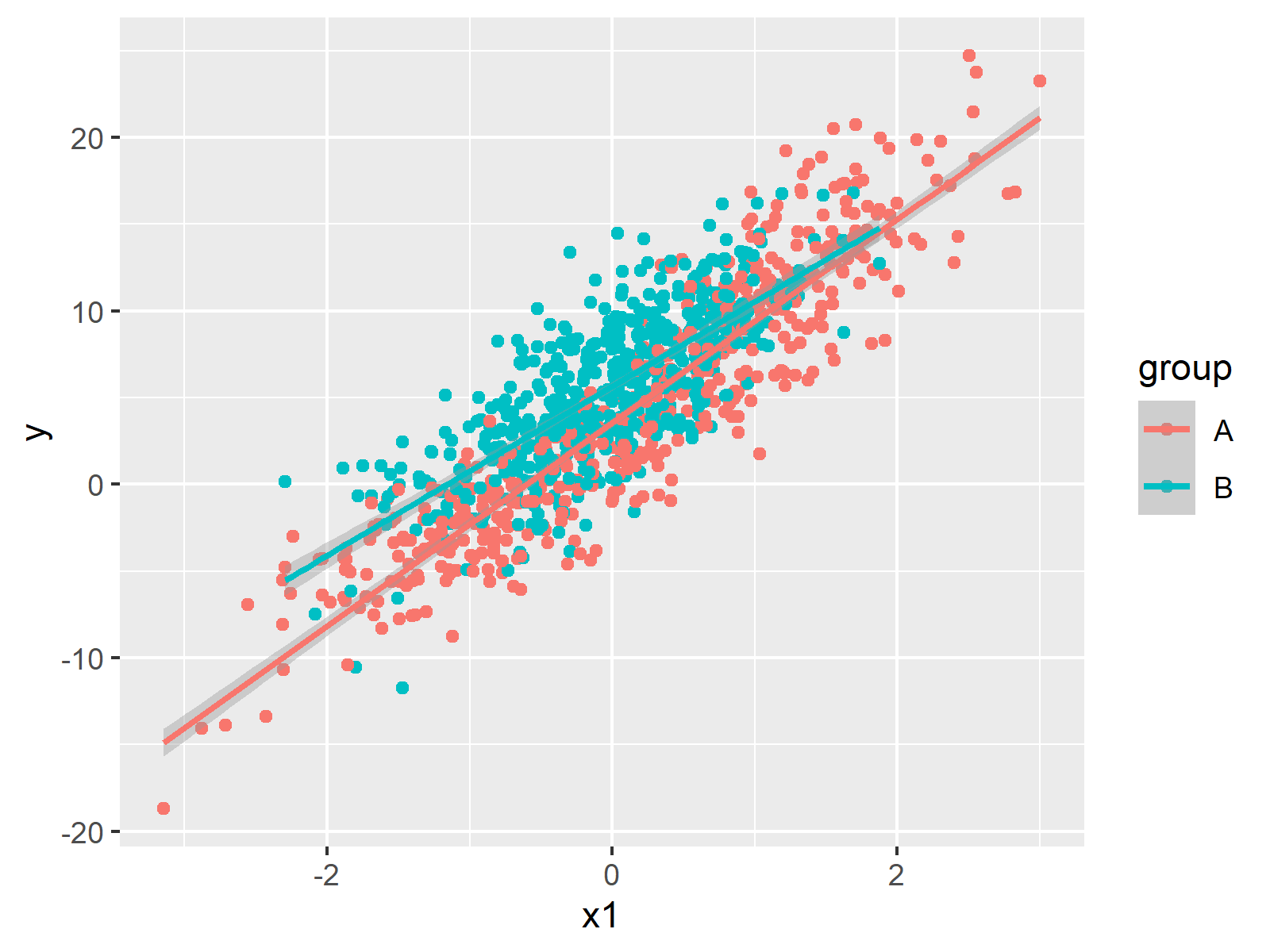
And the following code visualizes the predictor variable x1 and the target variable y in a scatterplot, including regression lines by group:
ggp_scatterplot <- ggplot(data,   # Create scatterplot
    aes(x = x1,
        y = y,
        color = group)) +
geom_point() +
geom_smooth(method = "lm",
    formula = y ~ x)
ggp_scatterplot
Again, the previous visualizations are only a tiny overview of the possible graphs that you can create by using the R programming language. You can believe me – R is just awesome when it comes to data visualization!
Summary
In this article, I have demonstrated some basic features of the R programming language. As you have seen, the R programming language provides easy-to-apply functions for the handling of data sets, for the analysis of these data sets, and for the graphical visualization of the data sets.
However, there is much more to explore! In case you are interested in more R programming content you may check out my website and my YouTube channel. On these platforms, I provide R programming tutorials for a large range of topics.
Last but not least, I want to thank Tomi Mester for giving me this opportunity to share my joy for R on his website. I hope I managed to convince you that R is a very useful programming language that is definitely worth adding to a data scientist’s and statistician’s skill repertoire!
Cheers,
Joachim