
Hey Folks! I am Fruzsi from Hungary, and I was a participant in Tomi’s 6-week JDS course in 2021.
In this article, I will present one of my hobby projects:
I analyzed tweets using sentiment analysis and a few more NLP (Natural Language Processing) techniques… I chose my research on a warm day in August 2021, and I finished them on a cold day in February 2022. What have I done during this period? Come and learn about my sentiment analysis journey.
What is sentiment analysis?
First of all, what is a sentiment analysis project?
Wait… I should start with NLP.
NLP alias Natural Language Processing covers everything concerned with the interactions between computers and human language, including text analysis. Specific NLP projects are working with written texts and even spoken words to create a model. Look at those well-known machine translation platforms such as Google Translate, Microsoft Translator, and Facebook Translation App that use NLP techniques.
Note: Here’s a cool article that shows the basics of NLP projects. Check this link out:
https://monkeylearn.com/natural-language-processing/
But forget the complicated NLP systems for now … I will discuss only the sentiment analysis part in this article… In my opinion, it is a great choice for understanding and practicing NLP basics. Well, actually, it isn’t an easy topic. But don’t be afraid, I try to explain everything in the most straightforward way so that you will understand everything in my article.
Use cases for sentiment analysis
Sentiment analysis is often used for product review analysis and social media analysis. It may be an excellent method to deduce general viewpoints of particular topics or groups of people. As for online businesses, it gives them valuable information about an online product or service. Here you can read how big companies are doing it.
In my project, I chose not profit-oriented topics.
I worked with keyword searching using the Twitter API. I got the data from day to day to find tweets for:
- #digitalisation,
- #globalization,
- #migration and
- #waterscarcity
and I have stored these to my server over a six-month period.
What analyses can you do with Twitter data? Follow along and I will show you a few examples.
Twitter keyword analysis: getting the data
As I mentioned, I collected data using the keyword search feature of the Twitter API.
Twitter API is a good tool for developers to build web applications based on data coming from (usually public) Twitter interactions. As a data scientist, you’ll like the feature that you can use to search and collect recent tweets by it.
You can catch a maximum of 1-week old tweets with the Twitter API. That’s not a problem. If you can automate your data-collection script, you can store the fresh data continuously and you can build your own tweet-database.
You can even build a data stream. With this application of the Twitter API, you can catch tweets as soon as they are published.
(If you are interested in collecting Twitter data, please visit https://developer.twitter.com website for more information. After you get permission from the Twitter API to use their data, I recommend you use the Tweepy Python library if you are a beginner in Python.)
Twitter keyword analysis: analyze the data!
Now, let’s move on from data collection to analysis!
What should you do when you feel you have collected enough data and want to analyze them?
Firstly, check how many tweets you collected. I created a bar chart to visualize that. It show my collected tweets segmented by the different keywords I focused on: 
Okay, nice.
Let’s analyze the tweets’ text a bit!
First, create a word cloud from the messy tweets. True, it is a popular way to visualize the most important words from an infinite stream of text.
It’s an image filled with words where the size depends on the frequency of times the word appears in the text. How can a wordcloud turn an enormous amount of text into one picture – that’s easily interpretable?
Let me show you a few important text-preprocessing and cleaning methods.
Data cleaning steps during tweet analysis
The code-snippets below include the modifications of:
– URLs,
– hashtags,
– letter capitalization issues,
– word contractions, and
– punctuations.
First, use a Python built-in library, called re to remove URLs and hashtags. Then the third line of code below is looking for words that are mistyped (e.g. looook, lettter and so on). Then, I apply a simple lower() function that will convert uppercase letters to lowercase.
import re
#URL remover (links are not needed)
df['frtweet'] = df['frtweet'].apply(lambda x: re.sub('(http[s]?):\/\/\S+', '', x))

#remove hashtags
df['frtweet'] = df['frtweet'].apply(lambda x: re.sub('#+', ' ', x))

#remove capitalized letters
df['frtweet'] = df['frtweet'].apply(lambda x: x.lower())
The next step is to import the contractions library including a Python dictionary where the keys are the contractions and the values are the full forms.
With that, you can call a function that implements the modifications using this dictionary. Check the code snippet below to understand how it works.

Here’s the Python library I used: https://pypi.org/project/contractions/
So I applied this function to my twitter dataset with:
import contractions
df['frtweet'] = df['frtweet'].apply(lambda x: contractions.fix(x))
And as a last step, I removed all punctuations from the text using re.sub() function.
#remove contractions
df['frtweet'] = df['frtweet'].apply(lambda x: _fix_contractions(x))

#remove punctuation
df['frtweet'] = df['frtweet'].apply(lambda x: re.sub(r'[^\w\s]', '', x))
These data cleaning steps are enough to create a word cloud visualization without any error.
Note: Here, I won’t go deeper into pre-processing (like tokenization, stemming/lemmatization). And, I won’t talk about text vectorization and supervised-modelling, either. If you are curious what are these, check these links out: link #1 and link #2.
Note 2: I can also recommend a hands-on course on Udemy, too, namely: Applied text mining and sentiment analysis by Benjamin Termonia. Here, you can not only get a detailed explanation of text processing and modeling, but also you can practice them step-by-step in Python.
Finally: a word cloud in Python
Okay, back to the word cloud visualization in Python. After implementing the preprocessing steps shown above, you can use the wordcloud and matplotlib python libraries. Just a few lines of code and your wordcloud is ready. It is a spectacular and straightforward visualization of any text analysis:

You can make neater your word cloud if you utilize the parameters of the WordCloud function.

It is nicer, isn’t it? Of course, you can export your images and set the resolution of them with this short line of code: plt.gcf().set_dpi(1500). (With this, you can define the resolution of your image as DPI (Dots Per Inch).
You can go deeper into my word clouds by visiting my Google Photos shared folder using these links:
- (human) #migration: https://photos.app.goo.gl/3kjSkRFoHBsYwRVs9
- #digitalisation: https://photos.app.goo.gl/TMbTvE263uHh6QBT7
- #globalization: https://photos.app.goo.gl/AAfhUSKypoY9LtT57
- #waterscarcity: https://photos.app.goo.gl/sjQPczPLJVQTNcSi7
If you want to read more about the wide-range options of the wordcloud Python library, I leave here some helpful links that I used as a resource when I learned about it:
- https://towardsdatascience.com/how-to-create-beautiful-word-clouds-in-python-cfcf85141214
- https://www.datacamp.com/community/tutorials/wordcloud-python
- https://www.analyticsvidhya.com/blog/2021/08/creating-customized-word-cloud-in-python/
Sentiment analysis with VADER (basics)
You probably noticed that I visualized tweets classified into a group of positive or negative sentiments.
If you have checked the links above, you may have read already about the basic models used in text analysis projects. Similarly to regular data science projects, you need a training dataset to train models in NLP projects.
But this time, you won’t need to collect your own training datasets: a cool data-processing solution was already developed and published in GitHub: that’s VADER.
The authors of VADER (not from Star Wars) presented their model in a scientific article. Their model evaluates the sentiment of a tweet based on the words in the tweet. It takes the individual value of the words from a dictionary that was rated (labeled) manually by humans. Over 9,000 token features were placed on a scale from “[–4] Extremely Negative to [4] Extremely Positive, with allowance for [0] Neutral.”
The result of the VADER algorithm will be an aggregated score on a scale from -1 (most extreme negative) to +1 (most extreme positive). To sum up, every tweet gets a compound score based on their words. You can find more about VADER in the link below.
https://github.com/cjhutto/vaderSentiment
Visualized with BOKEH
This interactive BOKEH visualization shows VADER doing its magic.
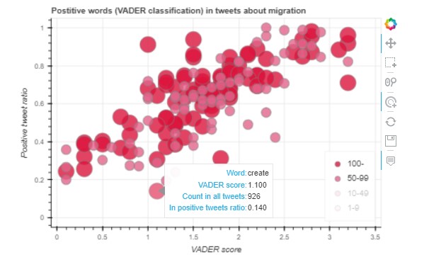
You can see a scatter plot where the X-axis represents the words’ value in the dictionary. Then the Y-axis represents the number of positive tweets from all tweets. (In other words, if a word appears in a tweet, what is the portability that the compound score of the tweet will be positive or negative?)
The bubbles’ size shows the frequency of words in the dataset. The low-frequency words were turned off in the picture. You can play with similar charts published on the links below.
Here:
Positive words:
https://exploratory.io/viz/Pvi7JHe4xd/bubble-chart-1-positive-words-DXe9RWD1Sr
Negative words:
https://exploratory.io/viz/Pvi7JHe4xd/bubble-chart-2-negative-words-HiG1TGw5tS
Conclusion
That’s all for now, folks. I showed you a few cool tools I used for my hobby projects. I hope you liked them a lot and you’ll get inspired to do your own hobby project.. In the following article, I’ll provide you with a few more interesting examples for tweet analysis. Stay tuned.
Fruzsi Tulezi