
Exploratory Data Analysis (EDA), Machine Learning projects, Economical/Financial analysis, scientific research, even single articles on different topics in newspapers involve examining correlation between variables.
- But what is correlation?
- How do we use it?
- Can we measure it?
- Can we visualize it?
- What is causation?
- How is it helping your business?
You’ll find the answers to all those questions in this article!

The author of this article is Levente Kulcsar from Sweden. He creates awesome data science content on his twitter account. Follow him, here.
What is correlation?
According to Wikipedia: “Correlation refers to the degree to which a pair of variables are linearly related.” [1]
In plain English: correlation is a measure of a statistical relationship between two sets of data.
Let’s call those two datasets X and Y now for a little example:.
Variables of X and Y are positively correlated if:
- high values of
Xgo with high values ofY - low values of
Xgo with low values ofY
Variables X and Y are negatively correlated if:
- high values of
Xgo with low values ofY - low values of
Xgo with high values ofY
Note: It’s important to note that correlation does not imply causation. In other words, just because you see that two things are correlated to each other, it doesn’t necessarily mean that one causes the other. More on this later.
Here are visualizations of correlations. (Stay tuned, we will learn how to create these scatterplots!)
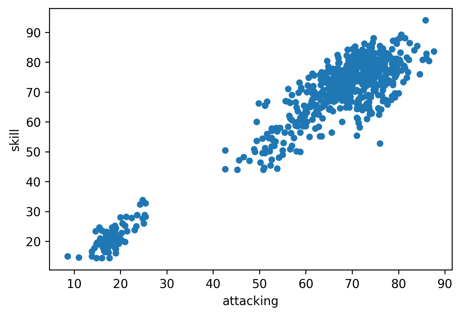
In this example the two variables are skill and attacking. It is clearly visible that high skill values go with high attacking values, so they are positively correlated.
The next scatterplot is a visual presentation of a negative correlation (not so strong however):
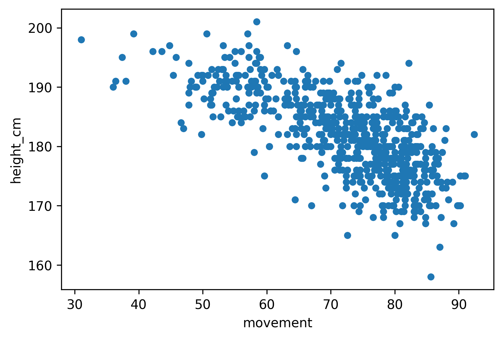
In this case high height_cm values go with low movement values.
How can we measure correlation?
To measure correlation, we usually use the Pearson correlation coefficient, it gives an estimate of the correlation between two variables.
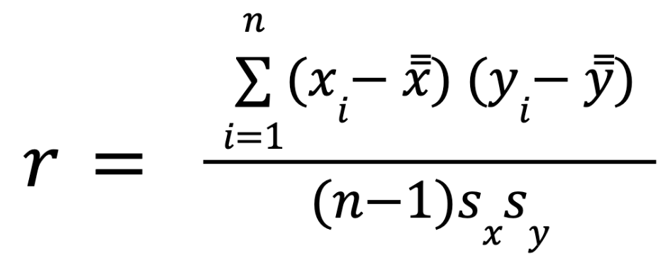
To compute Pearson’s coefficient, we multiply deviations from the mean for X times those for Y and divide by the product of the standard deviations. Here is the formula: [2]
Note: as always – it’s important to understand how you calculate Pearson’s coefficient – but luckily, it’s implemented in pandas, so you don’t have to type the whole formula into Python all the time, you can just call the right function… more about that later.
Pearson’s correlation coefficient is good to measure linear correlation.
Wait! Do we have nonlinear correlation as well? Yes, we have, so it’s time to define what is the difference.
- Linear correlation: The correlation is linear if the ratio of change is constant. [3] If we double X, Y will be doubled as well.
- Nonlinear correlation: If the ratio of change is not constant, we are facing nonlinear correlation. [3] To measure nonlinear correlation, we use the Spearman’s correlation coefficient. More on this here [4]
So back to linear correlation and Pearson’s coefficient. The coefficient always has a value between −1 and 1.
-1means perfect negative linear correlation+1means perfect positive linear correlation0means no linear dependency between variables.
A few examples from a Wikipedia article:
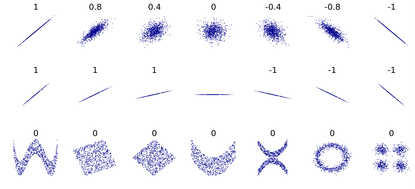
What does Pearson’s correlation coefficient tells us?
- the “noisiness” of the relationship,
- the direction of the relationship
What does the coefficient not tell us?
- The slope of the relationship
- If there is a relationship, but not necessarily linear. (E.g. in the image from the Wikipedia article above, we can assume that there is some kind of correlation in the bottom row, but since those are not linear, we cannot measure them with Pearson’s correlation coefficient.)
Correlation vs Causation
It is important to understand that if two values are correlated it doesn’t mean that one causes the other.
Correlation does not imply causation – as they say.
It only means that X and Y move together. But this correlation can be due to:
- Causation
- Third variable
- Coincidence
What is causation
Causation means that there is a cause-and-effect link between X and Y. The result of this link is that if a change in X occurs, a change in Y will occur as well.
A really simple example:
(Generally) when someone exercises more, they will gain more muscle.
But when we think about causation we need to be careful, because some problems can emerge.
Third variable problem
For example, we usually see a positive correlation between shark attacks and ice cream sales. Can we conclude that there is a causation between these variables? Of course not. The sales of ice cream won’t cause shark attacks and vice versa.
Instead, a third variable enters the conversation: temperature.
When it’s warmer out, more people buy ice cream and more people swim in the ocean. [5]
This is a typical example for the third variable problem. The third variable problem means that X and Y are correlated, but a third variable Z causes the changes both in X and Y.
Directionality Problem
Another thing we need to consider is the direction of the relationship.
Aggressive people watch lots of violence on TV.
But does violence on TV make them aggressive? Or they are aggressive, hence they watch violence on TV?
We cannot tell for sure.
Directionality Problem means that we know that X and Y are correlated and we assume that there is a link between them, but we don’t know if X causes Y or Y causes X.
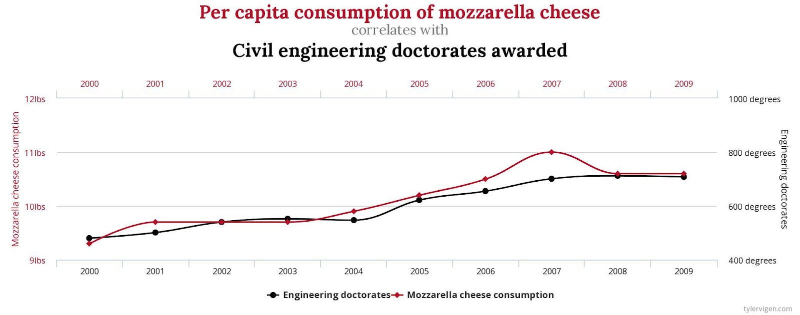
Spurious Correlation
A spurious correlation is when two variables are related through a hidden third variable or simply by coincidence. [7]
You can find some funny examples of Spurious Correlation here[6]
Correlation in Pandas
Now it is time to code!
First we need to import packages and our data. In this exercise we will use Kaggle’s FIFA 22 top 650 players.
import numpy as np
import pandas as pd
import seaborn as sns
import matplotlib.pyplot as plt
data = pd.read_csv('../input/top-650-fifa-22-players-simplified/Top_650_FIFA.csv')
This dataset contains player details from the well known soccer computer game. We will mainly focus on their skills, such as power, mentality, passing, shooting etc. Each player has a rating out of 100 in these categories.
Note: you can learn Pandas basics and how to load a dataset into pandas, here: https://data36.com/pandas-tutorial-1-basics-reading-data-files-dataframes-data-selection/
Correlation matrix – How to use .corr()
The easiest way to check the correlation between variables is to use the .corr() method.
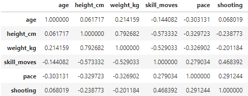
data.corr() will give us the correlation matrix for the dataset. Here is a small sample from the big table:

Note: If you want to learn in detail, how to read this matrix, check this article out.
We will use only some of the columns for better understanding. Also, columns like the index (Unnamed 0) and club_jersey_number are not relevant to us. We do not anticipate any connection between a jersey number and the player’s skills.
We will define a variable with column names and apply .corr() only on those columns:
columns = ['age', 'height_cm', 'weight_kg', 'skill_moves',
                    'pace','shooting','passing',
                    'dribbling','defending','physic',
                    'attacking','skill','movement','power']
data[columns].corr()
Again, here is part of the table:
Note: .corr() by default will use Pearson’s coefficient; we can change that by defining the method inside the parantheses. Use method= 'spearman' to check Spearman’s coefficient and nonlinear correlation.
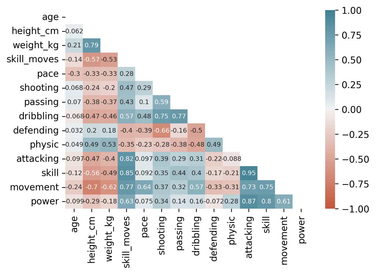
Coloring the correlation matrix (so it’s easier to read)
Since the matrix contains many numbers, it is hard to read. For better understanding, we can add some coloring.
In this example I used a gradient background called coolwarm, by adding .style.background_gradient(cmap='coolwarm') to the end of the code defined earlier.
The result for:
data[columns].corr().style.background_gradient(cmap='coolwarm')
will be something like this:
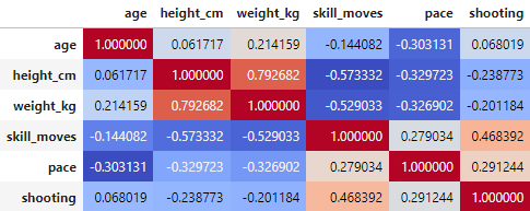
From the table presented this way, you can immediately find the negative and positive correlations.
Using these colors it is also easy to spot that the correlation matrix contains every value twice. It is mirrored on the diagonal.
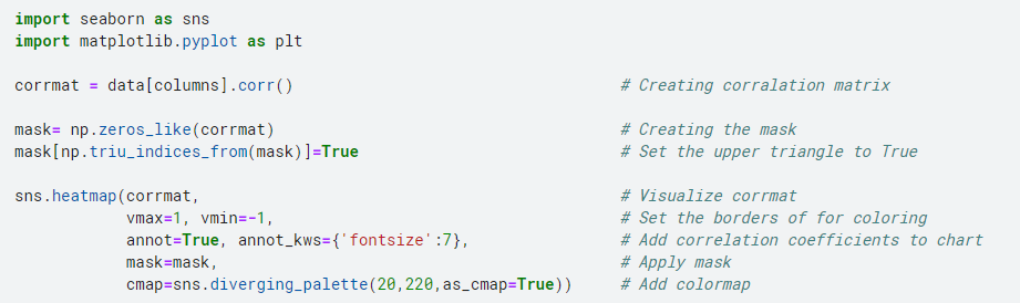
To clear the table even further we will use seaborn and masks.
Note: For a better understanding of how we use mask in this example click here [9]
import seaborn as sns
import matplotlib.pyplot as plt
corrmat = data[columns].corr()
mask= np.zeros_like(corrmat)
mask[np.triu_indices_from(mask)] = True
sns.heatmap(corrmat,
            vmax=1, vmin=-1,
            annot=True, annot_kws={'fontsize':7},
            mask=mask,
            cmap=sns.diverging_palette(20,220,as_cmap=True))
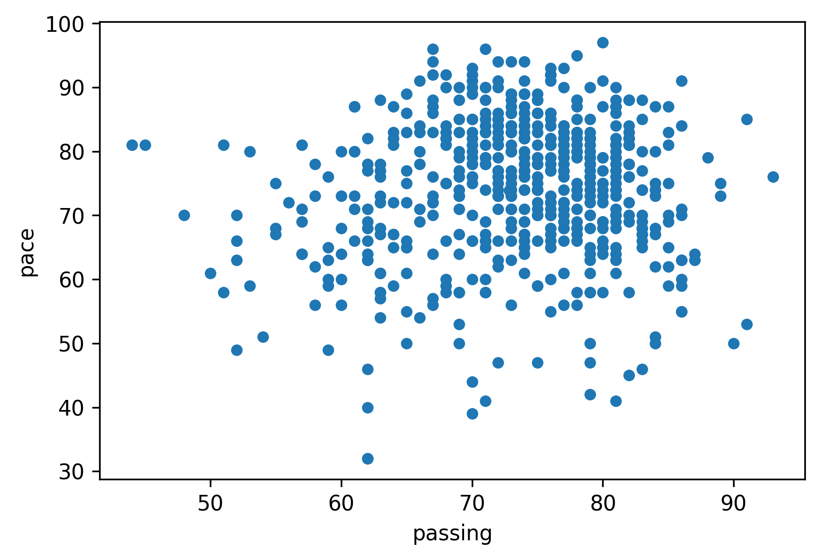
Scatterplots
We can visualize a pair of variables and check if they are correlated or not on scatter plots as well.
In Pandas we just need to use .plot.scatter() and define our X and Y variables:
data.plot.scatter(x='attacking',y='skill')
Note: Did you notice that this is the chart that we have already discussed at the beginning?
We know from the matrix that the correlation coefficient for the two variables is 0.95, so they are strongly, positively correlated.
We just need to change the x and y variable names to recreate the example chart for negative correlation. (corr coefficient is -0.7):
data.plot.scatter(x='movement',y='height_cm')
What about no-correlation? What does that look like?
Here is the example (corr coefficient is 0.1):
data.plot.scatter(x='passing',y='pace')
You can also use seaborn to visualize not just one pair of variables on scatter plots.
Adding .pairplots() will create a matrix of scatterplots.
More on pairplots here [10].
columns = ['age', 'height_cm', 'weight_kg', 'movement','pace']
sns.pairplot(data[columns])

How correlation can help your business?
Correlation is widely used in real-life decision making. You will find correlation in Marketing, Finance, Sales, basically we could mention domains endlessly.
A few benefits:
- Pattern recognition. In the big data world looking at millions of rows of raw data will not tell you anything about the business. Using existing information for better decision making will be crucial in the future. It can reveal new business opportunities, give insights about existing processes, and help to communicate clearly. Recognizing patterns is one of the main goals of data science and correlation analysis can help with that.
- Financial decision making – investment decisions. Diversifying is essential. Investing in negatively correlated sectors can help you mitigate risk.
For example: if the airline industry is negatively correlated with the social media industry, the investor may choose to invest in a social media stock. If a negative event affects one of those industries, the other sector will be a safer place for the money [11]
- Projections. If a company finds a positive correlation between two variables and has some predictions on the one variable involved in the correlation then they can try to make predictions on the second variable as well.
For example: Company X finds a positive correlation between the number of tourists in city Y and its sales. A 10% rise in visitors for the coming year is predicted in city Y. Company X can anticipate an increase in sales as well. Of course, when it gets to predictions, one should always consider the above mentioned correlation-causation issue.
All of the above-mentioned activities will enhance decision-making, reduce risk, reveal new opportunities through correlation.
Cheers,
Levi Kulcsar
Sources
[1]: https://en.wikipedia.org/wiki/Correlation
[2]: Practical Statistics for Data Scientists by Peter Bruce, Andrew Bruce, and Peter Gedeck (O’Reilly).
[3]: https://www.emathzone.com/tutorials/basic-statistics/linear-and-non-linear-correlation.html
[4]: https://en.wikipedia.org/wiki/Spearman%27s_rank_correlation_coefficient
[5]: https://www.statology.org/third-variable-problem/
[6]: http://www.tylervigen.com/spurious-correlations
[7]: https://www.scribbr.com/methodology/correlation-vs-causation/
[8]: https://www.statology.org/how-to-read-a-correlation-matrix/
[9]: https://www.kdnuggets.com/2019/07/annotated-heatmaps-correlation-matrix.html#
[10]: https://twitter.com/levikul09/status/1542051235510902784?s=20&t=vPWeG5_Yhi3AJ7RDo4ZsiA