

Tomi Gelo was one of the first participants in my 6-week data science course (the Junior Data Scientist’s First Month). Since then, he has done some pretty cool data science hobby projects. So I asked him to write a guest post about one of these. And he was kind enough to do so! Please welcome Tomi Gelo and the guest post of the week — which is about a cool analytics project on Twitter data sets!
You can do so much with it. From web development to machine learning. Some surveys say it is the most popular programming language out there. Yes, I’m talking about JavaScript. 😛
Without reading the title you might have expected something like Python or R here. After all, there are countless articles out there on how to do data analysis with those tools. Heck, I even did this same analysis in Python a few years ago.

So why am I even bothering with JavaScript, you ask?
Well, for one the Twitter archive data (which you can download here) are only provided in JSON format. This is unfortunate since I was initially looking to load a CSV file into my Python-powered workflow with a simple pandas read_csv command.
Note: the CSV file used to be provided as well until recently (beginning of 2020?).
Anyway, instead of fighting this I decided to embrace it by analysing the data using the language of the web (also great timing since I have been picking up some JS for a new project recently).
🐍 Look for this icon, which highlights references to Python/Jupyter
⌨️ Small notes about JavaScript are indicated with this icon
🍿This icon is just for fun
- List of Tools
- Getting the Data into Observable
- Preparing the Data
- Visualizing the Data
- Conclusion
- Resources (my analysis notebook, curated list of learning resources for Observable + more)
- About me
1. List of Tools
JavaScript
I will not attempt to explain JavaScript since many people with far more knowledge have already done this (check out the resources section at the end of this article).
Observable
Observable is “the magic notebook for visualization,” where notebook stands for a series of cells containing ‘normal’ text, code and data visualizations. Think of it as a web-based spreadsheet which runs on JavaScript.
🐍 If you are coming from the Python world this will feel very familiar to Jupyter notebooks!
If you haven’t already, make sure to check out the resources and open my Observable notebook to follow along. Take your time, I’ll wait.
D3.js
Next on our list is probably the most important JavaScript library for data: D3.js or Data-Driven Documents! I will not go too much into detail on D3 but there will be additional resources provided.
🍿Both D3.js and Observable were developed/founded by Mike Bostock – thanks, Mike!
Vega/ Vega-Lite
https://vega.github.io/vega-lite/
Another popular library which I’m going to use since it has a neat syntax for creating beautiful charts quick and easy.
🐍 Altair, which is a popular data viz library for Python, is actually based on Vega/Vega-Lite.
2. Getting the Data into Observable
If you have skimmed through my notebook you may be asking yourself where all the coding is happening. Since the order of the cells doesn’t really matter in Observable it has become standard practice to keep all the coding in the appendix section at the end of each notebook.
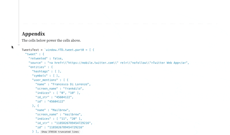
So to get your Twitter data into my notebook just look for the below line of code in the appendix:
TweetsText = FileAttachment("tweet.js").text()
Select your own tweet.js file from your computer after you downloaded your Twitter archive and replace it in the cell above. One easy way is to just click on the attachments icon on the right side of the cell.
Alternatively, you can also just explore my notebook without plugging in your own data.
3. Preparing the Data
After loading and parsing the tweets data we end up with an array of objects, where each object is a single tweet.
⌨️ In JavaScript, an object is a complex data type used to store data in key-value pairs. Arrays are a special form of objects using only numeric keys.
Here is an example object representing a tweet:
{
  retweeted: false
  source: "<a href=\"http://twitter.com/download/iphone\" rel=\"nofollow\">Twitter for iPhone</a>"
  entities: Object {hashtags: Array(0), symbols: Array(0), user_mentions: Array(1), urls: Array(0)}
  display_text_range: Array(2) ["0", "23"]
  favorite_count: "1"
  in_reply_to_status_id_str: "1147089424523677696"
  id_str: "1147204972750266375"
  in_reply_to_user_id: "22412376"
  truncated: false
  retweet_count: "0"
  id: "1147204972750266375"
  in_reply_to_status_id: "1147089424523677696"
  created_at: "Fri Jul 05 18:05:54 +0000 2019"
  favorited: false
  full_text: "@deadmau5 I was there 🐭"
  lang: "en"
  in_reply_to_screen_name: "deadmau5"
  in_reply_to_user_id_str: "22412376"
}
🐍 JavaScript objects and arrays are similar to dictionaries and lists, respectively, in Python.
I want to visualize the data showing different types of tweets (replies, retweets). Since this kind of data is not provided by default I’m going to create new arrays for this.
First let’s get an overview of the total number of tweets per type. The following code uses the reduce syntax in combination with the string method .startswith to reduce the big array of tweets to a summarized version showing only the per-type sum of tweets:
tweetsSumByType = tweets.reduce((acc, curr) => {
    const {tweets = 0, replies = 0, retweets = 0} = acc;
    if (curr.full_text.startsWith('@')) {
      return {...acc, replies: replies + 1};
    } else if (curr.full_text.startsWith('RT')) {
      return {...acc, retweets: retweets + 1};
    } else {
      return {...acc, tweets: tweets + 1};
    }
  }, {});
The resulting object looks like this:
{
replies: 3808
tweets: 6273
retweets: 774
}
Here we just do a quick conversion to an array for easier visualization:
tweetsSumByTypeArray =[{name: 'tweets', value : tweetsSumByType.tweets}, {name: 'replies', value : tweetsSumByType.replies}, {name: 'retweets', value : tweetsSumByType.retweets}]
tweetsSumByTypeArray:
[
  0: Object {name: "tweets", value: 6273}
  1: Object {name: "replies", value: 3808}
  2: Object {name: "retweets", value: 774}
]
I also want to create another array similar to the original one, but with the tweet type info included.
The following code uses the map syntax (together with the same .startswith trick) to create an array with a new ‘type’ (of tweets) field:
tweetsWithType = tweets.map(d => ({...d, type: d.full_text.startsWith('@') ? "Reply" : d.full_text.startsWith('RT') ? "Retweet" : "Tweet"}))
And here is an example object from the new array (notice the new field “type” at the bottom):
{
  retweeted: false
  source: "<a href=\"http://twitter.com/download/iphone\" rel=\"nofollow\">Twitter for iPhone</a>"
  entities: Object {hashtags: Array(0), symbols: Array(0), user_mentions: Array(1), urls: Array(0)}
  display_text_range: Array(2) ["0", "23"]
  favorite_count: "1"
  in_reply_to_status_id_str: "1147089424523677696"
  id_str: "1147204972750266375"
  in_reply_to_user_id: "22412376"
  truncated: false
  retweet_count: "0"
  id: "1147204972750266375"
  in_reply_to_status_id: "1147089424523677696"
  created_at: "Fri Jul 05 18:05:54 +0000 2019"
  favorited: false
  full_text: "@deadmau5 I was there 🐭"
  lang: "en"
  in_reply_to_screen_name: "deadmau5"
  in_reply_to_user_id_str: "22412376"
  type: "Reply"
}
⌨️ Map and reduce are both relatively new JavaScript features introduced with the ES6 standard.
4. Visualizing the Data
There are many ways to create data visualizations in Observable, ranging from reusing existing examples from other people’s notebooks to creating your own from scratch.
Let’s start with a simple bar chart. To make it even simpler I’m going to reuse this barchart template from Mike Bostock.
This is all the code needed to import the barchart and provide it the previously created array tweetsSumByTypeArray to create the visualization:
import { chart } with { tweetsSumByTypeArray as data } from "@d3/bar-chart"
And this is what it looks like:
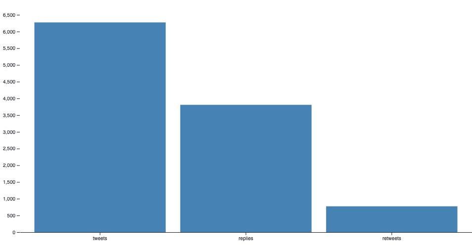
If you have plugged in your own data you should see your tweets divided by type here!
Another really cool chart to import is this sortable bar chart – you can also find it in my Observable notebook.
There are loads of charts like these created by Mike as well as other members of the community ready for you to import (again – resources section).
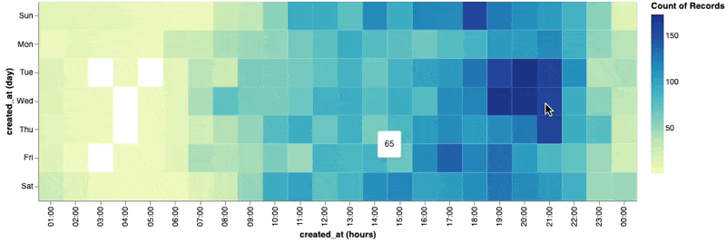
Here is an example visualization created with the vega-lite library. The below code creates a nice heat map showing the count of tweets grouped by the hour of each weekday:
viewof heatmap = vl.markRect()
  .data(tweets)
  .encode(
    vl.x().fieldO("created_at").timeUnit("utchours"),
    vl.y().fieldO("created_at").timeUnit("day"),
    vl.color().count(),
    vl.tooltip().count()
  )
5. Conclusion
Although not the first choice for many, JavaScript’s growing data ecosystem makes it a serious contender in the analytics field. Tools like Observable can really help push the envelope here. Who knows, maybe we’ll start seeing increasing demand for data analysts with JavaScript skills in the near future.
6. Resources
- 10+ years on Twitter Visualized – my Twitter analysis Observable notebook
- javascript.info – modern JavaScript tutorial
- MDN JavaScript – official Mozilla website on JavaScript
- JavaScript: the first 20 years – 180+ page paper on JavaScript’s history
- Curated list of learning resources for Observable
7. About Me
Tomi Gelo is a full stack data nerd specializing in data analytics, data engineering and cloud computing. He is currently working on projects combining those fields with web development. You can find out more on tomigelo.com.