
Not so long ago, I saw one of my data scientist friends speak in front of his whole company. He worked for two months on a great data project and he got some very cool findings with significant business value. He had 15 minutes to present everything. Unfortunately, he is not an experienced public speaker and his presentation didn’t go well. He spent too much time with technical details, his slides were confusing, he spoke too fast and on top of that, he ran out of time…
The end result: the value of his great data project didn’t get recognized and he had to lobby for another two months before at least a part of his work finally got used by his colleagues.
And again: he is a good data scientist, he ran a excellent project with real business value. The only problem was that when it came to presenting it, these values stuck in.
I think this story spotlights why data professionals should be familiar with presentation techniques. I’m not saying that every data analyst or data scientist should be the best public speaker in the world. But I think that everyone in this field should at least be able to give a meaningful and engaging talk about her own findings.
In this article, I’ll share the best presentation tips for data professionals that I’ve collected over the years.
Note: At the end of the article, I’ll link good books and a few awesome speeches by data scientists, too.
Presentation = Content + Design + Delivery
A remarkable presentation is strong in these three things:
- Content (What will you talk about? What is your message?)
- Design (How do you support your message with visuals?)
- Delivery (Your style, your voice, your gestures, eye-contact, etc.)
It’s like a three-legged stool. To make your presentation the best, all three legs should be equally stable. If any of the three is missing, you will fall.
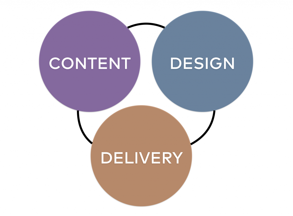
So when you prepare for your next big talk, think about these three aspects of it: content, design and delivery. But let’s dig into the practical tips and tricks for all three.
1. Great content
Know your audience!
As a data scientist, your job is to research things. Why would it be different when it comes to presentation? You have to know exactly who you will talking to because that will set the tone of your speech. So question number one: who is your audience?
- What is their initial knowledge on the topic?
- How technical are they?
- What are their demographics?
- What do they expect?
- …
Just think about my friend’s story from the intro. His highly technical presentation led to confusion because in the audience there were a lot of managers, business people and marketers who had no idea what he was talking about. He could have been much more successful if his audience was made up of data scientists who knew about all the technical things he mentioned. But that was not the case…
So before you do anything else, this is your number one task: get as much information about your audience as you can!
What’s your one-sentence takeaway?
Let’s play a game: think about the last conference you attended. Now, take your five favorite presentations from it. Could you tell me more than one sentence about each of them? I don’t think so. But that’s okay. This is how human brain works.
As a presenter, you have to prepare for this. You have to have a one sentence take-away and you have to build your whole speech around it. This serves two purposes:
- You can be more focused. You’ll know what your point is, so you can keep everything that supports that and throw away everything that doesn’t.
- You can ensure that your audience will remember exactly what you want them to remember.
If you know your one-sentence takeaway, you can repeat it multiple times, you can put it on your last slide, and you can even say “if you take home only one thing from this presentation it should be this: …”
Turn your data into a story!
Let’s be honest here: data is boring! (Okay, not for us, data professionals, but for non-data-scientists, it can be boring.) You know what’s exciting? Stories. Lucky for us, data is great at telling stories.
So to deliver an engaging presentation, go one level deeper and turn your data into a story.
How to do that? First of all, think about the human factor behind your data! Ask yourself: What does the data imply about the users’ motivations, feelings and struggles? What does the data show about the user journey? Did we find something unexpected or surprising?
Don’t leave these out from your presentation… Talking about data is technical and informational, but adding stories will help you affect the emotional part of your audience’s brain. And that will help them get involved with your message.
Here’s one of my best data presentation tricks, that I barely see from other data professionals:
Before my presentations, I often go to the company’s UX department and ask them to give me few short recordings from their recent usability tests that support my data-driven findings. Then, for every chart I also attach a short video about a real user, too. That helps business people to connect the story of that one user (qualitative) to the million anonymous data-points (quantitative).
This one little trick can turn your speech into a more story-based, more persuading and more engaging one.
So my third content tip for presenting data:
Do not just list statistics – turn your data into a story!
2. Great design
Don’t pack your slides
The most common design problem I see at presentations (not just presentations about data science, by the way): there is too much information on the slides.
Look at these two slides.
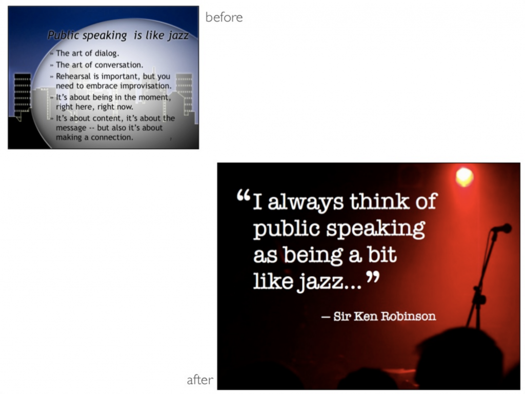
They are about the same thing. Which one is easier to process?
In my opinion, writing more than one sentence on a slide is a mistake.
You don’t have to write down everything that you will say anyway. In fact, it’s proven that when you are talking and showing slides at the same time, while your audience reads, they won’t listen to what you say. And if they don’t listen to you, why are you even there? You could send out the slides and skip the speech itself… Do you get my point?
The slides are there to support your message, not to spell out every detail of it.
I keep this rule with visualization: 1 slide = 1 chart + 1 sentence. Done.
The simpler the better
For me, an average slide looks like this:
Again, the slides are there to support you, not be the main attraction. So keep them simple.
- Never use 3D charts! They look great, but they are really difficult to read. And they can be misleading, too.
- Don’t use the funny flip-in, hop-in, pop-in animations. They don’t serve any purpose but they can easily steal your show. The only animations you should use are the simple appear and disappear animations.
(Note: Okay, if you really want to, just for fun, here and now, I’ll give you permission to use one funny animation per slideshow. ;-)) - Mind the signal-to-noise ratio! Eliminate everything that is not essential. Typical noises can be: company logo on every slide. Your name on every slide. (It’s enough to put these on the first and last slides.) Small and useless decorations. Etc…
Take a look at few of these slides from Steve Jobs – one of the most remarkable public speakers.
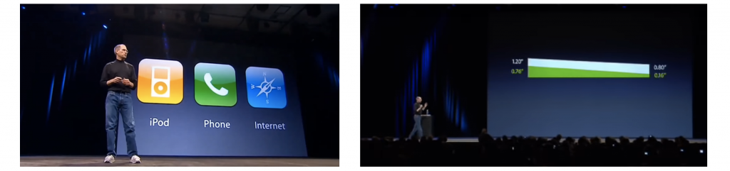
Simple but efficient.
Avoid stock photos!
I mean look at these folks:

Do you believe that this is a real business environment? Me neither. This picture feels fake. And that’s the problem with most stock photos. We all feel that they are not real. For most of my presentations, I try to use my own photos. (And when I don’t have a photo that I need, I just take my smartphone camera and shoot one in 1 minute.)
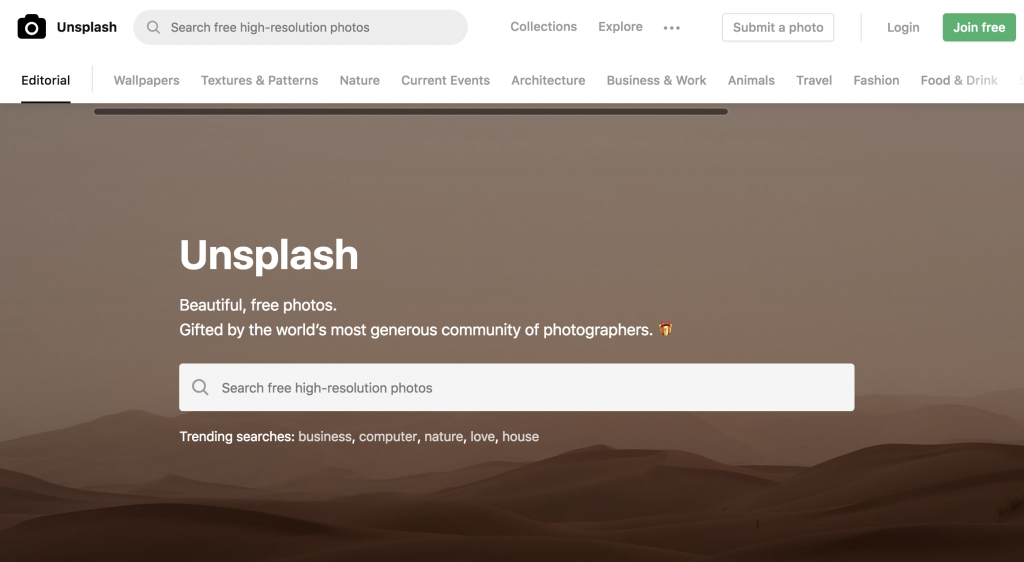
Alternatively, I recommend unsplash.com. I know, this is a stock photo site, too… but it’s an exceptionally good one. Compared to other websites, the photos are more real because they are sent in by their users. Oh, and it’s 100% royalty free.
3. Great delivery
The simpler the better (again)
“If you can’t explain it simply, you don’t understand it well enough.” – Albert Einstein
There is one thing that many professionals misunderstand when they get on the stage. They think they have to prove that they are good at what they do. So they use a lot of technical jargon, they skip over basic concepts, they never miss an opportunity to highlight the complexity of their profession and how deeply they understand the topic.
But when you are on the stage, you don’t have to prove anything. The fact that you are standing there is already good enough evidence that you are a credible person worth listening to.
So from that point on, your objective is to explain things in a way your audience understands.
Use simple phrases! If you are talking to a non-data-scientist crowd, don’t say, “statistically significant,” “pearson’s chi-squared test,” “k-nearest neighbors algorithm” – unless you are sure that they know what you are talking about.
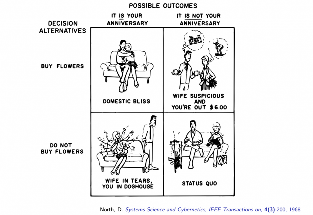
And if you really have to explain a complex concept, use a metaphor or a real-life example that brings the topic from highly technical to easily digestible.
For instance, here’s my favorite explanation for the concept of false positives and false negatives:
Or when I want to make it more fun, I use, this picture instead:
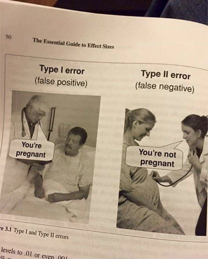
Remember: you should be able to explain complex concepts simply – so everyone understands what you are talking about.
Turn it into a discussion
I like to arrive at least 30-60 minutes in advance of my presentation. It’s enough time to double-check the projector settings, but it’s also great because I can take some time to converse with the audience.
That personal touch helps me to be more confident on stage because I feel that I’m talking to people who I know at least a little bit. The whole thing gets more friendly and more discussion-like – especially if I can react to some of the initial discussions in my speech, too.
So I suggest the same to you: try to make your one-way presentation more discussion-like! Try to involve your audience: ask questions, listen to their reactions and react appropriately.
The more you practice the better you become
I’ll never forget the first time I presented to more than 200 people. It was a 7-minute presentation and I was so nervous about it that I literally forget to breathe. So after 3 or 4 minutes I ran out of breath and I had a hard time talking. Luckily, I could overcome it with a joke. But there and then I realized that talking in front of people needs a lot of practicing and experience.
After that, I could consciously improve my on-stage breathing technique, so one year later I delivered another presentation to 400+ people without any trouble. (Note: I stopped at the end of the sentences to breathe and I also prepared jokes, so I was able to “recover” while the audience laughed.)
To be a good public speaker you have to practice a lot!
Everyone has different challenges: someone talks too fast, someone talks too slow, someone gesticulates too wildly, someone can’t keep eye-contact, someone loses track of time. The more you practice, the more you will learn about yourself and about what you have to get better at when talking to people.
Note: One of the most important elements in this equation is: getting feedback. The best place to practice your speaking skills – in my opinion – is Toastmasters. It’s a world-wide organization. They have more than 150,000 clubs in 142 countries. So there is a pretty high chance that there is one in your city, as well. They have 1 to 2 hour meetings where every attendant gets on stage at least once. And the best part: everyone gets feedback. They have tremendous experience and a polished system for helping people go from zero to hero with presentation skills. I don’t want to oversell them (I don’t have any affiliation with them anyway), just go to their website and check out what they do. Anyone can join. Oh, and did I mention that they are a non-profit organization? (My member fee in my city was $60 for one semester, so $2 per meeting.)
My favorite presentation books
Most of the presentation tips that you read in this article, I learned from these books.
(The links are affiliate links, but I added the non-affiliate versions of them, too.)
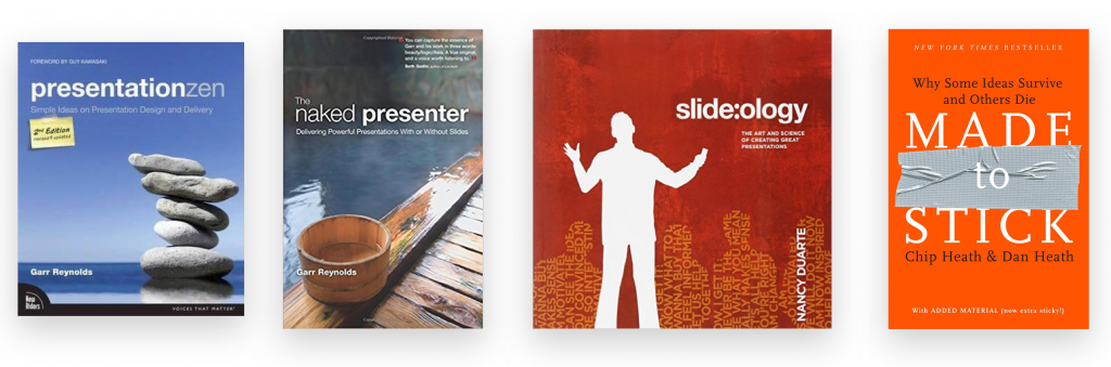
- Presentation ZEN: If you read only one book on presenting well, it should be this one. It’s a good read with nice stories — and at the same time jam-packed with value. Besides the practical tips, I liked it the most because it describes the mindset you should have very well. Find it here. (Or non-affiliate link: here.)
- Naked presenter: Another great book by Garr Reynolds. This one focuses on the delivery part only: how to be an engaging, confident and remarkable speaker. Find it here. (Or non-affiliate link: here.)
- Slide:ology: When it comes to presentation design, Nancy Duarte is one of my favorite author. This book is her best one. Many examples, case studies and best practices for how to turn a boring slideshow into a beautiful and meaningful one. Find it here. (Or non-affiliate link: here.)
- Made to Stick: What makes an idea stick? The Heath brothers researched this topic for several years. They found that people will remember your thoughts if it fulfils these six conditions: It’s Simple, Unexpected, Credible, Concrete, Emotional and it’s built on Stories. More about these in the book. Find it here. (Or non-affiliate link: here.)
Awesome data presentations
If you need inspiration, here are a few great speakers presenting data.
1) Steve Jobs, presenting the MacBook Air. Just the visual of how he compares the thinness of the two notebooks is remarkable in itself. But what comes after that is something that the audience will remember for a long time:
2) Shift happens (2007). A beautiful presentation about the data of our age. Simple, yet meaningful.
3) Without any doubt, Hans Rosling was one of the best professors out there; you could listen to him for hours. His dynamic style, his enthusiasm and the way he presented his data is unique, motivating and unforgettable.
4) Not that I think that I could be even close to the above mentioned examples, but just for fun let me add here my TEDx talk back from 2013. Mainly to show you, that you don’t have to be a presentation guru to give a good talk. Here, I tried to follow all the rules I mentioned in this article. (It’s in Hungarian but with English subs.)
Conclusion
Don’t be my friend from the intro! If you run a great data science project, make sure you pull off the presentation part, too! You don’t have to be the best public speaker, but you have to be good enough to present your data well enough to make an actual impact.
In this article, I showed you some of my best practices, but my main goals is to inspire you to start working on your presentation skills. It takes a lot of practice and it won’t happen overnight… But the process is fun – and you will see that it will be one of the most useful soft skills you have ever acquired.
- If you want to learn more about how to become a data scientist, take my 50-minute video course: How to Become a Data Scientist. (It’s free!)
- Also check out my 6-week online course: The Junior Data Scientist’s First Month video course.
Cheers,
Tomi Mester
Cheers,
Tomi Mester