
This is a guest post from Ben Collins – freelance data analyst and developer, and founder of The Collins School of Data.
What is Google Data Studio?
Data Studio is Google’s free data visualization and business intelligence reporting tool. It was launched in mid-2016 and came out of beta mode in October 2018.
It has a simple drag-and-drop interface, so you can easily add charts and build reports without needing any deep technical knowledge.
The premise is that you can connect all of your disparate business data sources and easily build beautiful, interactive dashboard reports to display that information, atop Google’s super-reliable, powerful, scalable architecture.
Why use it?
Ultimately, Data Studio is a tool you use as the final piece of your data analytics pipeline, to show your results visually and share insights and answers with others.
It’s free, which is a significant factor considering the steep cost of alternatives.
It’s simple and intuitive, so it doesn’t take long to get the hang of the basics. It’s very quick to create dashboards once you know the basics.
If you’re already using Google products in your analytics workflow, then it’s super easy to hook them up to Data Studio.
You get sharing and collaboration seamlessly built-in.
Of course, it has the reliability, scalability and support that only Google can provide.
It all starts with the data
The old adage “garbage in, garbage out” is as applicable to visual reporting as to any other sphere of computing.
Data Studio dashboards consist of two parts: the dashboard (obviously!) and the data source.
There are currently 18 Google Connectors which connect different Google platforms directly into Data Studio. One of these connectors is Google Sheets, which means that any data you can get into a Google Sheet is accessible for visualizing in Data Studio. In addition, you’ll see direct file uploads, popular SQL databases, BigQuery, Google Analytics, YouTube, Ads, Google Cloud services etc.
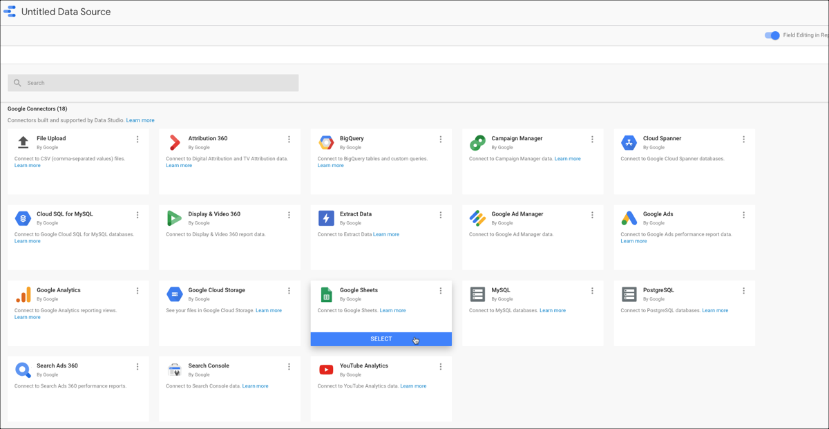
In addition, there are over a hundred partner connectors, which connect other third-party tools directly into Data Studio, although some of these connectors are paid services.
Finally, there are a handful of open source connectors and if you’re a developer, you can create your own community connector.
Data Studio works equally well for Google Sheets tables with 10 rows as it does with huge SQL or BigQuery datasets with millions of rows of data.
The first consideration, before you even open Google Data Studio, is to ensure that your data is ready, i.e. it’s accurate and complete.
Has it been de-duplicated? Have you checked that the numbers make sense? Do you have “impossible” dates way in the past or the future? Have you got spelling mistakes that will cause items to be wrongly categorized? Are you missing any data? Why is there no data for the month of May for example? (There could be a legitimate reason, but it’s important to know.)
It should be accurate and complete before you create and share a visual report which others may use to make decisions with.
Data Studio crash course
Ok, a quick crash course then:
1. Navigate to https://datastudio.google.com
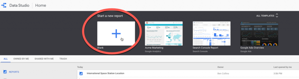
2. Click the big blue + symbol to create a new report.
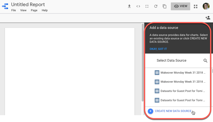
3. In the right side pane, click “CREATE NEW DATA SOURCE” at the bottom:
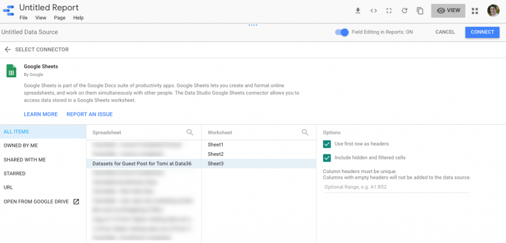
4. In this example, I’ve used Google Sheets, which is probably the easiest data source to start with, although feel free to connect to your MySQL or PostgreSQL databases.
5. Choose a Spreadsheet (here’s an example dataset, feel free to copy if you want). Then choose a Worksheet and Options in the Data Source window:
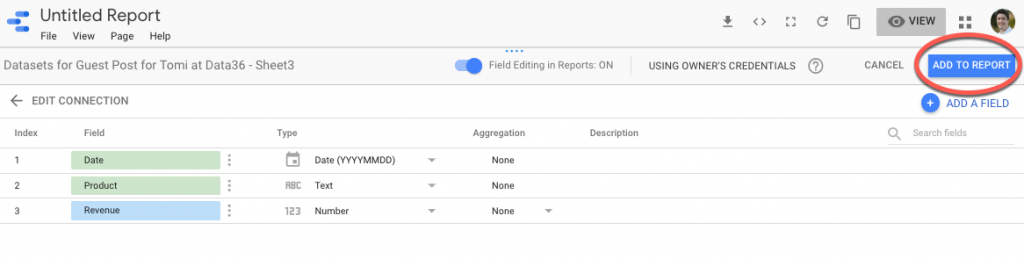
6. Next you’re presented with a list of fields that Google has imported from your data source. It shows the different settings for the fields (such as the data type and aggregation). You’re free to modify fields if you need to. When you’re ready click “ADD TO REPORT”
7. Your next screen is Data Studio itself, which has that familiar Google UX and easy drag-and-drop interface:
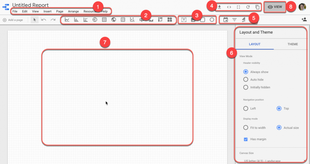
You have:
- Menu bar
- Chart options. Drag and drop charts from here onto the canvas
- Text, Image and Shape objects to add to dashboards.
- Controls to download, embed, make fullscreen, refresh and share your report
- Filtering controls, which allow you to add date filters, field filters and data filters
- Options pane in the sidebar, which will relate to the object currently selected in the canvas.
- The dashboard canvas.
- The View button which toggles into presentation mode (which is how others will see your dashboard if you share it).
The best advice at this stage is to experiment with the tool.
Connect to different data sources and try all the different charts to see what they do.
I find it helpful to work with small, simple datasets in Google Sheets so I can see the data side-by-side with the Data Studio report.
Pro Tip for Data Studio
Once you’ve used Data Studio for a little while, you’ll want to use filters with your charts. By default, when you add a filter it applies to your entire dashboard, i.e. to any and all of the charts in your dashboard.
Sooner or later though, you’ll want a filter that just operates on a specific chart only. So how do you do that?
Select the filter and the specific chart that you want to sync together, by either dragging a box across them both or holding down Ctrl (or Cmd on a Mac) as you select both. With them both selected, right click and choose Group:
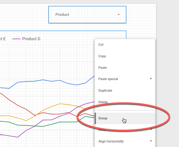
Bingo! The filter will now be joined to this chart only.
Data visualization best practices
Data Visualization is a huge and complex topic. One that people can make whole careers out of studying.
However, there are a handful of universally accepted best practices that will dramatically improve your reports if implemented. And they’re not hard, you just need to remember to keep them in mind.
Choose the most suitable chart
Different charts exist for different situations and it pays to use the one most suited to the task at hand.
There’s a tendency to favor fancy, all-singing-all-dancing charts that grab readers’ attention, but oftentimes simpler, well established charts like bar charts and line charts are preferable because people understand them.
It’s also good to keep in mind that there’s no perfect chart (and corollary, no perfect dashboard)!
Consider this comparison of a pie chart and bar chart, showing the same Google Analytics sessions data by country:
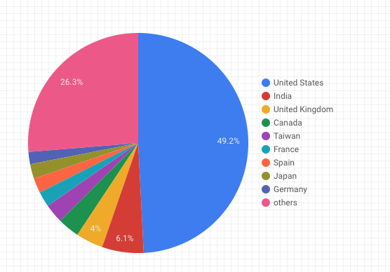
The pie chart gives a really clear picture that half our traffic is from the U.S. but it does a lousy job if we’re trying to understand the other countries or absolute values. Pie charts are a poor choice for showing data with many categories.
Consider the same data in bar chart format:
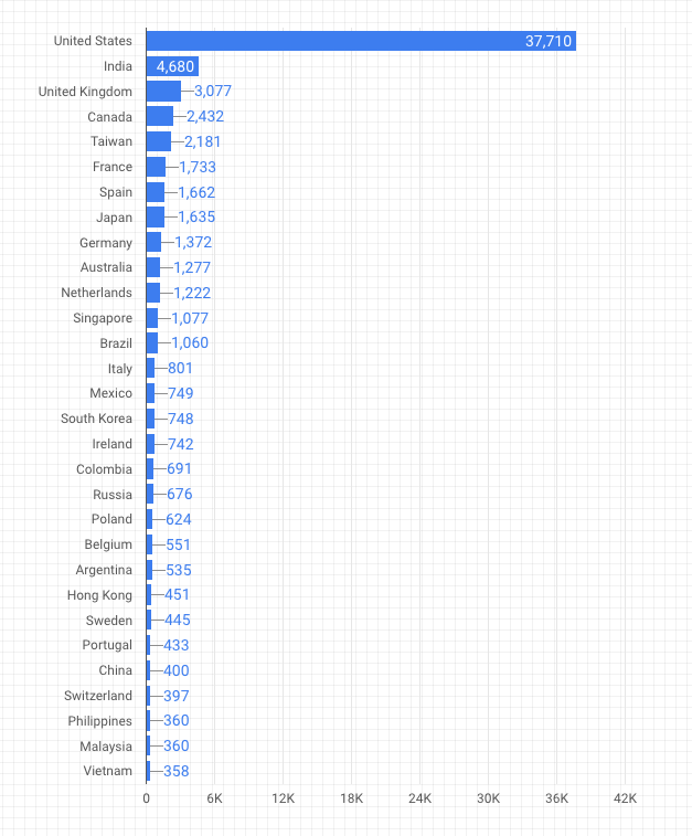
It’s easier to read values for the other countries. It shows how reliant this website is on U.S. traffic, although it doesn’t give us the proportion easily. Also, it doesn’t show that there are more countries in the long tail, with even less traffic.
Keep it simple and avoid clutter
The goal is to reduce the cognitive processing time used by the reader of your report to understand your message.
If the reader has to wade through dense tables, or interpret difficult charts, then there’s a higher chance they will fail to absorb the information, misunderstand your message or, worst of all, switch off and abandon the report.
As the designer of the chart or dashboard, you can remove unnecessary clutter from the charts or dashboards (e.g. do you need a legend for only one line? Probably not.).
Focus on the story
Taking it one step further, you can help your reader by providing context around your visuals.
There are a few techniques you can use to achieve this.
- Use colors to bring attention to your message.
- Use words to inform the reader and provide context.
- Add labels to important points on your charts.
Consider a before and after chart makeover of this relatively simple line chart, showing the fluctuating revenue of four products over a 30 day period:
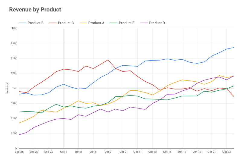
It takes you a few minutes to pick out the story from this chart because it’s hard to see Product C since the lines are all overlapping.
Instead, look at this same chart with some small tweaks to call out Product C and tell that story. The reader is much more likely to absorb your message in a much shorter time. The chart is more compelling because it has purpose.
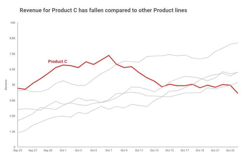
Product C has been colored red to bring it to the reader’s attention, and the other products have been colored grey to push them into the background. However, they’re still visible to provide context.
The label for the Product C line is next to the line, so it’s quick and easy to see.
The title has been changed to explain the chart and help the reader quickly understand what the chart is showing.
These were three fairly minor changes — the underlying data and the chart are identical — but they’ve had a significant impact.
Advanced options
This article has only touched the tip of the iceberg with Google Data Studio.
There’s so much more you can do, so let me mention some of the advanced options that are available:
- Data Blending. Do you need data from different sources shown side-by-side? No problem. By using a common field in both datasets (e.g. date) you can blend the data and show for example revenue and users in the same chart.
- Calculated Fields. Calculated fields are like formulas in your spreadsheets. You can apply transformations to columns of data inside of Data Studio. A very simple example might be to transform an entire column to uppercase. A more complex example might be using the CASE statement to categorize different referring domains in Google Analytics into specific groups.
- Getting creative with the default charts. Even though there are a limited number of charts, you can do a surprising amount of customization once you know a few tricks.
- For developers, you can create custom data connections to web APIs and also embed your own custom chart types.
Resources
Ask questions and search for answers on the Google Data Studio forum.
Don’t get stuck staring at a blank canvas. Take inspiration from the work of others at Data Studio gallery. Remember: great artists steal!
If you’re really interested in furthering your data visualization skills, I’d recommend getting involved in the Makeover Monday community. Every Monday the community creates visualizations from the same dataset. It’s fascinating to see the different approaches people have and learn by trying to recreate what other people have created.
Finally, I publish Data Studio tutorials on my own site here.
About the author
Ben Collins is a freelance data analyst and developer, and founder of The Collins School of Data.
He creates online courses and write about working with data, with a particular focus on tutorials for data analytics, automation and dashboards, using Google Sheets, Apps Script and Data Studio.
Ben previously taught Data Analytics for General Assembly and began his career as a forensic accountant living in Excel.